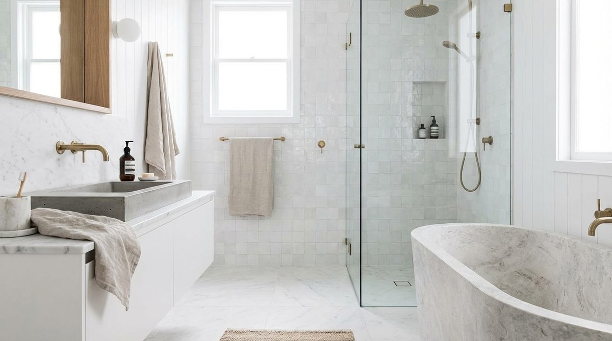
It used to be that bathrooms were strictly utilitarian. White tiles and gray industrial fixtures were the safe bets. They were easy to clean and easy to ignore. Not anymore. The slow life philosophy has taken over the entire house. This isn’t about fast decor trends that fade in a season. It is about building a space that feels timeless. You don’t need a massive budget to achieve this. You just need to look at the right colors. Spring collections show us that durable, deep tones can completely transform a sterile room into a sanctuary.
Embracing Natural Earth Tones
The era of sterile perfection is over. Warm, natural earth tones are taking the lead. These hues ground the space. They feel inviting rather than clinical.
Beige and Off-White for Gentle Mornings
Waking up to blinding white light can be harsh. It feels like a hospital. It freezes the mood. To fix this, natural shades act as a soft background. They are designed to last for years, not just weeks.
Replace pure white with off-white. Swap cool grays for sand beige. These mineral tones catch the light but warm it up. The result is a cocooning effect. It helps you start the day calmly. This approach also suits busy family life. Visual comfort matters more than stark cleanliness.
Adding Terracotta for Immediate Warmth
You can add depth without spending a fortune. A single bold touch is often enough. Terracotta is the standout earthen tone this year. Inspired by traditional clay, this vibrant color wakes up impersonal spaces.
Paint a single wall. Choose textured basins. Pick carefully chosen linens. These small changes integrate perfectly into a reasoned design approach. The color evokes an authentic, Mediterranean way of life. It pushes away the gloom of overly smooth interiors.
“Terracotta revitalizes dull spaces without requiring a full renovation budget.”
Bringing the Outdoors In
Spring demands that we invite nature inside. The bathroom becomes a relaxation sanctuary. We are moving away from loud, short-lived colors. The trend is strictly toward subtle, calming pigments.
Olive and Sage for a Vegetal Cozy Vibe
The call of nature is intense during spring. Plants offer a genuine escape from stress. The trend favors subtle hues over bright, lasting ones.
Sage green and olive green excel in this calming role. They pair beautifully with solid wood furniture. This combination affirms our visceral need to slow down. You can even use olive green zellige tiles. They add undeniable character to a room. If you find good deals, this is a budget-friendly way to upgrade your space.
Deep Blues for a Boudoir Atmosphere
Sometimes immersion takes the form of dense, dark tones. These create a theatrical bubble. The aquatic vibe shifts away from cliché sky blue. It moves toward intense, sophisticated variations.
Midnight blue and petrol blue drape around bathtubs. They line the lower parts of walls. They bring instant visual depth. The result is an intimate, muted atmosphere. It is not difficult to maintain daily. These deep blues age beautifully. A thoughtful layout can last decades without losing its charm.
Most bathrooms feel off because there is no anchor. You pile on soft beiges, dusty pinks, and sage greens. It looks nice for a second. Then it looks muddy. You lose the modern edge. The fix is practical. It is structural. It lives in the hardware.
Stop treating black fixtures like an afterthought. They are the spine of the room.
Why Matte Black is the Non-Negotiable Anchor for Modern Bathrooms
You can have the softest, most organic color palette imaginable. If you pair it with chrome or brushed nickel, the room floats away. It feels dated or clinical. Matte black stops the drift.
It cuts through the noise.
When you install matte black shower profiles, towel racks, and especially matte black faucets, you introduce a graphic line. Think of it as a pencil sketch over a watercolor painting. The colors remain soft. The black frame holds them in place. It prevents the “poudrous” (powdery) tones from looking washed out.
This is not just about style. It is about durability and character.
- Contrast without weight: Matte black frames natural tones without making the space feel heavy or cave-like.
- Graphic impact: It provides a stark, elegant boundary that defines the zone.
- Timelessness: Chrome fluctuates with trends. Black, when done in a matte finish, stays relevant because it relies on shape and texture, not just shine.
“It is an intelligent investment that gives character and sublimates the entire setup with terrifying simplicity.”
If you are renovating, do not skip this. Cheap gloss black fades and scratches. Matte is forgiving. It hides fingerprints better. It grounds the eye.
Balancing Warm Minerals and Cool Plants for a Lasting Look
Once you have the anchor, you build the rest of the house around it. The goal here is balance. Not symmetry. Balance.
You are mixing warm, mineral tones with cool, vegetative freshness. This combination creates a space that feels both energizing and calming. It is refreshing. It is indestructible in terms of style.
Here is how you execute the mix without creating visual chaos:
- Start with the walls: Go for luminous beige sand. It acts as a neutral canvas that reflects light.
- Add the vanity: Introduce a sage green vanity unit. The green pulls the “vegetal” note. It feels alive.
- Introduce warmth: Use terracotta accessories. A vase. A rug. A soap dispenser. This adds the “mineral” warmth.
- Tie it together: Use the matte black faucets and hardware mentioned above. They sit between the warm terracotta and the cool green, acting as the neutral bridge.
This specific combination of beige, sage, terracotta, and matte black creates a perfect visual equilibrium. It works in small powder rooms just as well as master baths.
Why This Approach Beats the “Clinical” White Bathroom
We spent decades chasing that sterile, hospital-white look. It felt clean. But it felt cold. It lacked soul.
By shifting to warm materials and pigmented tones, you unlock the comforting potential of the room. A bathroom should be a refuge. It should align