You go into the room. It looks good. But something feels strange. The furniture is correct. The layout makes sense. Still, the room feels cold or chaotic. You can’t say exactly. Usually the problem is not the arrangement. It is the harmony of colors.
February continues. Winter continues. You spend more time inside than you plan. The need for renovation is great. Fear stops you. Lean on white. It’s safe. But it can feel sterile. Clinical.
Owning a space means more than just choosing a shade. It means finding a balance. In 2026, the trend will shift away from risky brights. We see sophisticated associations. Pairs that last through all seasons. Colors that calm the mind without tiring the eyes. You don’t need a big budget. Sometimes a can of paint and the right shades are enough to change everything.
This is how you can change the mood of your interior with these special color combinations.
Inviting organic earthiness to warm interiors
Winter calls for texture. It needs warmth. This year, the design world looks back to the essentials. We see palettes that come straight from nature and craftsmanship. These pairs are best if you already have the ingredients at home. Think of wood. Linen. Ceramics. If you have these elements, these color schemes will look like a natural extension of your interior.
The instant comfort of terracotta and soft off-white
This is probably the hottest pair of the year. Terracotta offers the intensity of burnt earth. It has a visual power that is hard to ignore. But used alone? It can darken the room. Especially when there is little natural light in winter.
Enter soft off-white. Pure white offers a strong contrast here. However, the off-white softens the blow. It adds an almost edible richness to the mix. This combination instantly creates a cocoon. It is protective. Ideal for living room or bedroom.
So that it does not feel heavy, attach the terracotta to one wall. The end wall works well. Let the off-white brighten up the rest of the room. The result is depth without darkness.
Zen break with sage and sand beige
Need a place to escape? Try this duo. sage green is muted. A little gray. It resembles dried vegetation and herb gardens. It has a calming effect that is perfect for bright living spaces.
Pair it with Sand Beige. Beige adds depth. It brings natural elegance. This mix is perfect for a winter coastal vibe or a chic country style. It’s easy to live with. You don’t need to change your furniture. It harmonizes with light wooden parts. It sits comfortably next to white or natural colored cotton textiles.
Felted elegance in coffee brown and ivory
Brown had been out of favor for too long. It making a strong return. But not just any brown. We’re talking about a deep, powerful coffee brown. This choice instantly adds a touch of classy elegance. It feels timeless. Like in the lobby of a boutique hotel. Perfect for a dining room or serious living room.
To avoid the “dark box” effect, you need Ivory. Ivory is lighter than beige. Warmer than white. It modifies the volume. Imagine coffee brown wainscoting on ivory walls. It structures space. It ensures the flow of light. It’s perfect for anyone who wants character but doesn’t want to give up the classic style.
Invest in soothing sophistication to adjust the light
Light is the most important ingredient of good design. Especially when the days are short. By choosing the right colors, you can customize this light. You can amplify it. Or you can turn it down for intimacy.
The depth of petrol blue is softened by off-white
Petrol blue is fascinating. It is located between blue and green. It changes with the lighting. It adds personality without being aggressive. It’s the perfect choice to add character to a dull room.
Pair it with off-white to make it stand out without darkening the room. This contrast is elegant. Modern. It maintains clarity and emphasizes a strong style. Place a petrol blue panel in front of the window in the living room. Surround it with off-white colored walls. You get impressive depth. The room remains breathable.
Cocoon of Tenderness in pearl gray and dusty pink
The combination of pearl gray and dusty pink is a smart solution for relaxation rooms. Think master bedrooms or home offices. Pearl gray guarantees neutrality. Modernity. Dusty pink adds subtle warmth.
This palette promotes concentration. It promotes relaxation. Secret? Choose dusty pink or nude pink. Avoid bubblegum pink. You want a felted, grown-up look. This combination beautifully reflects the soft light of winter mornings.
A natural and modern combination of sage green and warm gray
Sage Green is the highlight of 2026. His best ally? Warm grey. Unlike beige, warm gray tends towards taupe. It gives a modern, almost urban impression.
This combination is popular in modern interiors. Spaces that want to maintain a connection with nature. It’s balanced. Not too cold either. Not too rustic. It works especially well in open kitchens or bathrooms. It creates a relaxing, spa-like atmosphere. Clean. Quiet.
Start with one wall. Test the light at different times of the day. Color can change everything. Or nothing. It depends on the shadow it casts.
Sometimes you just need a visual impact to bring a room to life. If your entryway or home office feels flat, stop playing it safe. Bold contrasts not only define the space, but also give it an identity that more expensive furniture cannot provide.
芥末黄与无烟煤色:一对富有创造力的情侣
这是勇敢者的选择。 芥末黄辛辣、阳光; 它会立即唤醒你的心情。 将其与哑光无烟煤灰色搭配,你会得到一种真正有效的图形张力。 深灰色缓和了黄色的热度,黄色则打破了灰色的阴郁。
它非常适合入口、狭长的走廊或创意工作空间。 在无烟煤色的墙上涂上芥末黄色的单门或拱门。 突然间,a forgotten passage变得有意为之、充满活力。 您可以使用颜色来定义区域,而不会增加physical clutter。
“无烟煤色缓和了黄色的热情,而黄色则照亮了灰色的严肃。”
Charcoal Black vs. Pure White: The Timeless Standard
黒と白は決して時代遅れになることはありません。 2026 年には、dense, deep charcoal blackとまばゆい純白の組み合わせを検討してください。 これは最もシャープな形のミニマリズムです。highlights architectural details—moldings, fireplaces, staircases。
ここではバランスが鍵となります。アクセントや一面の壁に黒を使うことで空間に重さを感じさせません。 白を明るく反射するキャンバスとして機能させます。 このハイコントラストの背景は、装飾アイテムを際立たせます。 額入りのギャラリーの壁でも、緑豊かな植物でも、アンティークでも、はっきりと目立ちます。
How These Bold Color Choices Redefine Your Style
Adopting these combinations is a way to think about interior design sustainably. By choosing colors that complement each other, you create a foundation that does not need to be updated the following year.
It also has a practical side. A strongly and uniformly colored room needs fewer accessories to complete the whole. This is responsible decorating. It reduces impulse purchases and leads to a more careful choice. The effort is reduced by the fact that Painting Services takes care of most of it, which saves money in the long run.
Always start by testing the paint on a small area. See how it looks at 8am and 5pm. February light and July light are completely different. The color changes. The light changes. The eyes adapt.
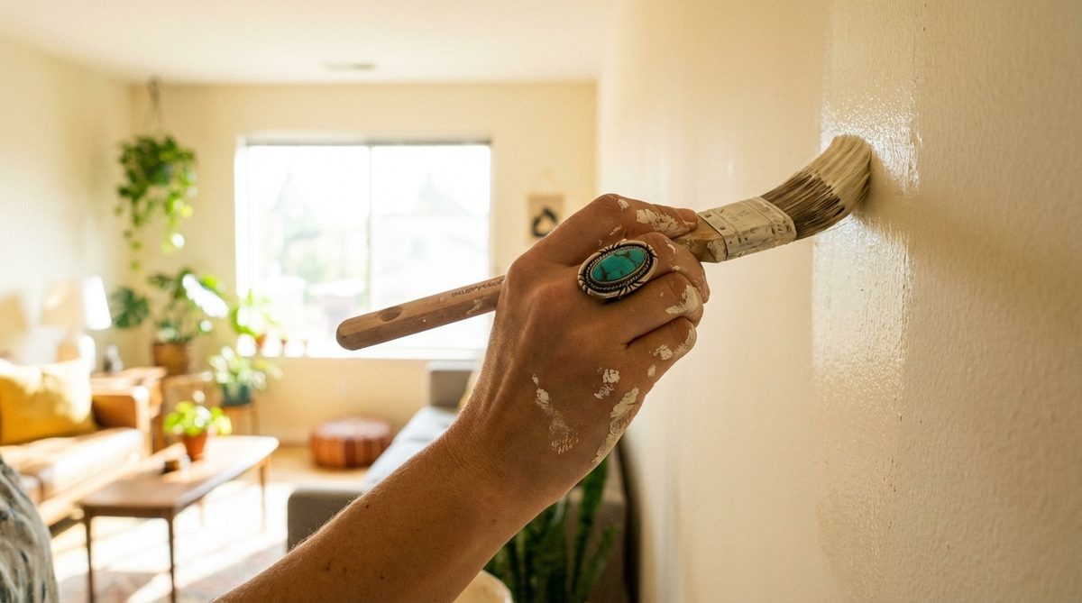
Changing the color of a wall is one of the easiest DIY projects. It’s affordable and makes a big impact. Whether you lean towards terracotta and cream, or petrol blue and off-white, you can give your home soul while respecting the budget. It’s not about whether you can do it. Which pair will you choose before spring arrives?