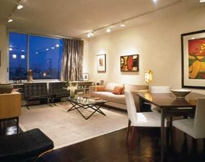
Form used to follow function. That was the rule. If a chair didn’t serve a purpose, it didn’t belong in a modern home. Today, that rigid interpretation feels stale. We have expanded the definition of utility. A vase isn’t just for holding flowers. It’s for catching the light. It’s for sparking joy. In dense urban apartments, we carve out space for these decorative frills because delight is a functional necessity.
You are likely reading this because you are tired of clutter. You want a home that feels curated, not collected. The goal isn’t to strip your space down to a sterile, minimalist void. It is to pare back to quality basics. This clears the runway. It creates breathing room for the one or two pieces that actually matter to you. These might be architectural salvage finds like carved column fragments or antique grilles mounted as art. They might be heirlooms passed down through generations. A sharp, modern backdrop makes both types shine. It gives them a fresh stage to perform on.
Why does this matter now? Because city living is chaotic. You might be here for the energy. Maybe you are young and hungry for the pulse of the metropolis. Or perhaps you are empty-nesting, seeking a vibrant, less homogenized environment after years of suburbia. Maybe you moved back for your kids, believing a diverse city offers better opportunities for their growth. Or maybe you never left. Maybe you are stuck in a rural box, dreaming of a sophisticated urban ambience you can recreate at home, miles away from the actual grid.
Whatever your reason, the challenge is the same. How do you bring the best of city life indoors without creating a museum? You need a chic, comfortable base. You need to be city-savvy in your design choices.
The approach changes depending on the shell you live in. A bland white box apartment requires a different strategy than an old-fashioned townhouse. An industrial loft poses its own set of problems. Comfort in a raw concrete space is hard to manufacture. Freshness in a dated brownstone requires careful editing.
Start by ruthlessly eliminating the noise. Not just physical clutter, but visual noise. Keep only what serves a clear purpose or delivers undeniable aesthetic pleasure. This is not about following a trend. It is about creating a setting that reflects who you are right now. Your circumstances shift. Your design should too. If you are starting out, you need flexibility. If you are returning, you need depth. The modern homeowner doesn’t just decorate. They curate an experience.
Which brings us to the practicalities. You cannot achieve this look with cheap filler. You need materials that age well. You need tools that last. Safety matters, especially when dealing with older structures or heavy salvage pieces. But beyond the hammer and nail, the real work is in the selection. It is in the decision to leave something blank. To let a wall breathe. To trust that less, when chosen well, feels infinitely more.
The city outside is loud. The home inside should be a counterpoint. Not an escape, but a refinement. A place where function includes the function of feeling good.
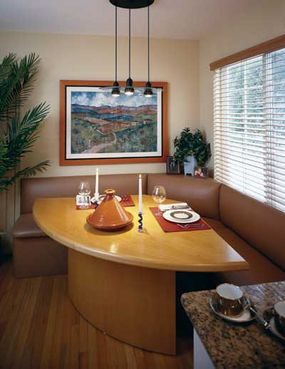

Shopping for a place to call your own? Stop and look at the full landscape.
Different housing types offer different pros and cons. What works for a twenty-something might fail a retiree. Here is how to navigate the options without losing your mind or your money.
The Rental Reality Check
Rental apartments work well if you are starting out, starting over, or just testing a neighborhood before buying that dream castle. But you hit a wall fast: landlord-imposed limits.
No red-painted walls? Common. Red is a pain to cover up. You will likely need to restore the space to its original condition. Keep the improvements you installed—custom shades, chandeliers, cabinets—but strip the changes.
So how do you make it yours? Use paintable decor and movable furniture. Negotiate hard with your landlord. If you need an exception to the rule, get it in writing in the lease.
Condo Living: Budget and Style
Small condos serve as excellent first homes or smart retirement downsizing moves. But watch the fees. Mortgage rates might be low. Condo assessments often are not.
Choose a building with amenities you actually use. Don’t rush to fill the space. Go for a pared-down style. It looks sophisticated. Not skimpy. Use rich color accents. Pick intriguing focal points.
Want a red lacquered kitchen wall? Do it. You own the place.
Large condos and co-ops range from ranch-sized to mansion-sized. Design choices mirror single-family homes. Installation challenges do not. Measure twice. Measure the service elevator. Seriously. Big furniture gets stuck.
Industrial Lofts: Space vs. Amenities
True industrial lofts offer affordable square footage. Few amenities. Same for converted retail storefronts or garages. You get space. You build the living zones. You install the kitchen. You install the bath.
Crave open spaces? Hate reconstruction? Look for rehabilitated industrial buildings. Smart developers have done the heavy lifting. These converted lofts exist in many cities.
Townhouses and Rowhouses
Townhouses and rowhouses are multistory. Small footprint. Some have lower-level garages. Townhouses share one or two walls with neighbors. Rowhouses share common walls in a series.
Think San Francisco’s painted ladies. Or NYC and Chicago’s brownstones. These vintage homes look fresh with eclectic, modern decor.
If you are downsizing, edit ruthlessly. Keep functional items. Keep beautiful items. If you always lived traditionally, buy contemporary pieces for new functions. The mix gives your heirlooms a fresh look.
Preparing for the Future
Retiring? If the kitchen or bath needs work, upgrade with universal accessibility. Lower countertops. Shower grab bars. Stay comfortable in the space for years.
Starting Out: Smart Furnishings
Just starting out? Buy dual-purpose furniture. Make minimal space work. Especially in studio apartments.
Buy the best upholstered pieces you can afford. They reward you with years of comfort and style. Fill gaps with functional, funky accents. A small end table. A nightstand.
Create personal background treatments. Colorful. Imaginative. Keep installed products and fixtures neutral. Protect resale value. You will move up. Or out.
Continue to the next page to learn about different types of modern decor.
For more ideas:
– Cabin Decor
– Country Decorating Ideas
– Decorating Ideas
– Window Treatment Ideas
– Kitchen Decorating Ideas
– Dining Room Decorating Ideas
– Bedroom Decorating Ideas
– Bathroom Decorating Ideas
– Home Office Decorating Ideas
– Home Spaces
– Interior Decorating
Types of Modern Decor
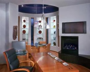

Balancing Light, Sound, and Space in Urban Homes
Visual privacy isn’t just about hiding from the neighbors. It’s a safety feature. In dense city environments, you need window treatments that block sightlines without turning your home into a cave. The goal is style that functions.
Bottom-up pleated shades are a smart move here. They let in natural light from the top while keeping the lower half opaque. You can see the sky; they can’t see you. The aesthetic is clean, tailored, with a subtle nod to Asian design principles. If you prefer texture, wood or bamboo blinds add warmth. Roman shades offer elegance without the fuss. These options blend easily into modern, eclectic, or transitional interiors.
Floor-length draperies have a specific trick: they make ceilings appear higher. But there’s a catch. If you have radiators or AC units under the window, those long curtains can trap heat or block airflow. Pull them back. Or choose a length that stops just above the unit.
For the hardcore modernist, particularly in loft conversions, skip the fabric. Install glass blocks. They admit light while obscuring shape. It’s a 1950s modern touch that fits perfectly in industrial buildings. You can also use glass blocks as interior room dividers. Light moves through; visibility stops.
Managing Urban Noise Pollution
Visual privacy is only half the battle. Audio privacy is often more critical for sanity. Noise pollution disrupts sleep. It causes health issues. Whether you’re hosting late-night parties or trying to sleep through them, sound insulation matters.
If you are the source of the noise, dampen it. Thick carpeting on floors absorbs impact. Acoustical ceiling tiles reduce overhead transmission. On walls shared with neighbors, install cork panels or other baffle materials. These stop sound from leaking into adjacent units.
If you are the victim of noise, the strategy is the same. Cover hard surfaces with soft ones. It’s a simple rule: soft over hard. It works from both sides of the wall.
Vetting Buildings and Downsizing Smartly
You can’t control your neighbors. You can control where you live. When shopping for a new place, vet the management. Talk to the condo board. Talk to the landlord. Check with local police to see how they handle noise complaints. Do they enforce quiet hours?
Ambient noise like traffic is unavoidable. But if a neighbor plays opera at max volume next to a toddler’s bedroom, there should be a remedy. Be wary of buildings where the board refuses to enforce rules, especially if the noise doesn’t spill outside. Ask “what if” questions before signing.
Storage is the next hurdle. It’s not as urgent as safety, but clutter kills design. The solution is brutal: bring less stuff.
If you’re starting out, start lean. Buy furniture that meets basic needs. Ignore hand-me-downs that don’t fit. Choose quality pieces that fold. “Campaign” furniture is a good example. It includes folding chairs and tables in styles ranging from Swedish modern to French Empire. They pack away when you don’t need them.
Use storage ottomans. Use under-bed boxes. Dual-purpose pieces save square footage.
If you’re downsizing, be ruthless. Sell or give away big furnishings that don’t fit your new space. Keep only what functions. Keep what you love. Keep heirlooms. Fill the gaps with items that actually give you a thrill. If it doesn’t do one of those three things, it’s just taking up room.
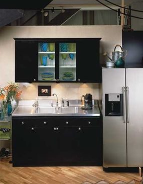

Hidden Storage Solutions Beyond the Closet
Once you’ve curated your furniture list and stopped buying what you don’t need, the real challenge begins: where does everything go? Linens, books, electronics, toys—the pile is still there.
European armoires have held their ground in the American market for decades, and they aren’t going anywhere. They are practical, not just trendy. Look for models designed to house specific categories. Some hold clothing with hanging rods and drawers. Others are built to mask home entertainment centers or even serve as a discreet home office cubicle.
If your rental lacks built-ins, or if the existing closets are too shallow to be useful, classic wardrobes are a solid fix. These tall wood cabinets come in various sizes. They offer a plug-and-play storage solution that doesn’t require a contractor.
Maximizing Depth With Built-Ins
If you have the option, install built-ins. Put them everywhere you can.
Take a tiny dining room. Add bookcases to multiple walls. Suddenly, the space feels impressive and highly functional. You don’t need deep shelves to make it work. Eight to twelve inches of depth is enough for ample storage.
Space your shelves every 12 to 18 inches. Hang hooks at eye level for items that need quick access. Want to mimic the organization of school lockers? Turn standard shelves into cubbyholes. Add vertical supports at 12- or 18-inch intervals. It keeps things tidy and visually interesting.
Using Color to Manipulate Space
Color choices change how your eyes read the dimensions of a room. This matters most when you are working with limited square footage.
Warm colors like red, orange, and yellow advance. They seem closer to the viewer. In a small room, this visual shortening effect can feel cramped. If you love warm hues, stick to tints. Pink, peach, and beige are softer options. Pair them with lots of white paint to maintain a sense of airiness.
Cool colors like blue, green, and violet recede. They push the walls back. This makes a room feel longer and more open.
Be careful with saturation. Bright versions of cool colors can shrink a room, especially if they contain red or yellow undertones. Dilute these shades with white paint to create tints. You get the hue without the claustrophobia.
Grounding Pastels and Glossy Finishes
Pastels can feel too sweet on their own. Ground them with black or brown accents. The contrast adds weight and structure.
Think about contemporary pairings:
– Black with ice pink or periwinkle
– Chocolate with aqua
– Tan, peach, and olive
You don’t have to follow these rules. Mix your own combinations.
Glossy finishes matter too. Dark shades in a glossy paint reflect light. This creates a lively, rich feeling that bounces around the space. It helps keep the room from feeling heavy, even with darker tones.
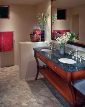

Painting Bold Colors Without Overwhelm
You love jewel tones. Primary colors. Hot pastels. Maybe you do. But painting every surface in a deep ruby or electric blue? That’s a fast track to visual fatigue. The trick is restraint. Use the strong color on a single focal wall. Paint the rest of the walls and the ceiling a pale tint or pure white. You get the drama. You also get psychological breathing room. It’s the difference between a statement and a scream.
Ground the space. Against those pale walls, use medium tones on large upholstered pieces. Keep the floor in darker tones. Chic neutrals work here: black, brown, gray, tan, beige. Or pick subdued shades of colors you actually love. If you’re stuck, go with green. It acts as a neutral with almost anything.
Accent colors in drapes, pillows, and small accessories? Go bright. Go crazy. Your goal is an environment that delights today without suffocating you by next week. Or tiring you out by next month. The smaller your space and budget, the more you’ll appreciate this balance.
Using Patterns to Manipulate Space
Patterns do more than look good. They change how we see size and shape. Try laying floor tiles diagonally. It makes the floor look bigger. The eye follows the longest line. Vertical stripes in drapes lend height. They add dignity. Horizontal lines? They make a room feel lower but longer. That creates a sense of ease. Especially in modern spaces.
Solid colors usually make a room appear larger and more peaceful. They don’t engage the eye aggressively. Busy patterns create excitement. But they also create visual activity. It can feel like clutter. Tone-on-tone patterns add interest without overwhelming. Solid colors in heavy textures do the same job. Remember this: any pattern you choose will be amplified by everyday clutter. Keep it simple.
Mixing Eras for an Eclectic Look
Purely traditional styles fit classic city homes. Your taste might demand more flexibility. Here are options that work.
Mix modern and traditional pieces. You can create a sophisticated eclectic look. Avoid a jarring mishmash. Choose pieces from various eras that share a specific look. Delicate or massive. Formal or casual. Find that common thread.
Want a hearty look? Mix the earliest modern styles with rustic Arts & Crafts or Mission designs from around 1900. Pair them with other straight, hearty styles. Think contemporary pieces in oak. Wall units and trestle tables fit well here. Finish with strong lines and earthy colors. Arts & Crafts, American folk art, or African art and textiles work great as finishes.
Want a lighter look? Sleek, shapely Art Deco pieces from the 1920s to 1940s look great with today’s soft modern and postmodern curves. Especially in cocktail tables and upholstered seating. French 18th-century pieces are more ornate than modern styles. But their curves harmonize with Art Deco. Mid-century modern pieces in sleek leather and chrome are a sharp alternative. Finish with vintage Art Deco accents in glass and silver.
Use transitional pieces. Use them throughout or as a bridge between modern and traditional elements. Transitional design is simpler and sleeker than traditional. But less stark and angular than modern. Major furniture manufacturers have produced transitional groups since the 1960s. Finding king-size beds, home electronics wall units, computer desks, and other pieces should be easy.
Don’t overlook accent furniture. The transitional qualities of 18th-century Shaker or late 19th-century Art Nouveau are worth considering. For accessories, choose colorful Depression glass, geometric folk art, or other treasures that bridge yesterday and today.
Going Purely Modern
Use a purely modern design. It’s an approach admired by many architects. It’s also easy. You can buy top-of-the-line French and Italian modern pieces through an interior designer. Affordable Swedish modern pieces at home stores. Many levels in between exist.
Chrome and leather are one way to go modern. So are naturally pale wood and nubby linen. For accent pieces, look to Africa and Asia for simple, sophisticated art and artifacts.
Whatever take on contemporary you like, keep things simple.
- Banish clutter with handsome baskets and boxes or behind cabinet doors.
- Skip the cute collections. Don’t strew any kind of collection all over the room. Group pieces, whether you have three or thirty, in one display area. Maximum impact. Easier care.
- Help clean your indoor air. Give yourself the calming benefit of nature with a houseplant or two. But only if they’re big and healthy specimens. Consult a florist or greenhouse about plants that thrive in your home. Is your space large and sunny? Or do you have low light? If you travel, you’ll need something that survives with minimal water. When plants pass their prime, toss them or give them away. Unless you really enjoy tending them.
- Use mirrors to capture pretty views. Visually expand, even double, the size of your space.
Color makes a huge difference in the effect of your home’s decor.
For even more decorating ideas, see:
- Cabin Decor
- Country Decorating Ideas
- Decorating Ideas
- Window Treatment Ideas
- Kitchen Decorating Ideas
- Dining Room Decorating Ideas
- Bedroom Decorating Ideas
- Bathroom Decorating Ideas
- Home Office Decorating Ideas
- Home Spaces
- Interior Decorating
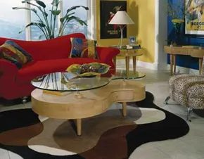

Breaking the Neutral Mold with High-Impact Color Palettes
Modern design often gets a bad rap for being too sterile. We associate clean lines and minimalism with coldness. But that stereotype is outdated. The latest approach proves you can have structure without sacrificing soul. It starts with a neutral foundation. Think crisp white walls, light wood floors, and simple furniture silhouettes. This blank canvas sets the stage for something bolder.
Designers are no longer afraid to inject serious personality into these spaces. They are using color as the primary driver of the aesthetic. You see this in three distinct strategies that move beyond beige.
The Sherbet Experiment: Pistachio and Raspberry
One of the most striking trends is the use of sherbet-inspired hues. It sounds playful, but the execution is sophisticated. Imagine a room anchored by pistachio green. It’s soft, almost pastel, but with enough saturation to feel substantial. Pair that with bursts of raspberry. The contrast is sharp. The green grounds the space; the pink adds energy.
This combination works because it avoids primary intensity. It’s refreshing. It feels light. The neutral furniture allows these specific shades to pop without fighting for attention. It’s a case of selective color use. You don’t paint the walls. You choose accents, textiles, or a single statement piece in these tones. The result is chic. It’s cheerful without being childish.
Primary Colors Done Right
Then there’s the more aggressive route. Red, yellow, and blue. These are the building blocks of art class. Bringing them into a living room requires precision. Too much, and it looks like a toddler’s playroom. Too little, and it disappears.
The trick here is balance. Designers cut these strong primaries with creamy white. The white acts as a buffer. It lets the eye rest. It prevents the room from vibrating with intensity. The red might be an armchair. The yellow, a throw pillow or artwork. The blue, perhaps the rug or a side table. When balanced against a neutral backdrop, these colors look intentional. They look curated. They look modern.
Grounding the Brights with Earth Tones
Color alone isn’t enough. It floats. You need weight. That’s where the natural elements come in. Wood floors are non-negotiable in these setups. They provide a tawny, warm base that contrasts with the coolness of white or the brightness of paint.
Area rugs play a similar role. Look for those with earthy undertones. Terracotta, rust, sandy beige. These shades bridge the gap between the vibrant decor and the architecture. They add texture. They add depth. Without them, the room feels flat.
The mix of modern crispness and organic warmth is what makes these spaces work. You get the visual clarity of contemporary design. You get the emotional warmth of natural materials. And you get color that actually inspires.
Which approach fits your home? Do you lean toward the soft pistachio or the bold primary?
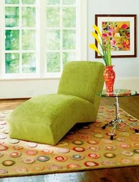

Curating Color Without the Chaos
Contemporary design thrives on restraint. If you want the palette to stay grounded, lean on neutral accents. They act as a buffer, keeping the overall aesthetic from spinning out of control. But if the goal is to inject energy, don’t shy away from bold hues.
The trick lies in selection. Pick a few well-chosen works of art and decorative accessories in colors you genuinely love. Limit yourself. One or two statement pieces are enough. Too many, and the effect dilutes.
Clutter-free contemporary style does something specific: it gives color a high-impact punch. Empty space allows the eye to rest before hitting the vibrant details. This negative space is not wasted; it’s functional. It ensures the color pops rather than blending into a busy background.
Start with a neutral base. Paint walls, choose large furniture in beige, gray, or white. Then, introduce your chosen hues through smaller, movable items. A bright rug. A singular abstract print. A vase in a deep, saturated tone. These elements can be swapped out as your taste evolves. The structure remains stable. The color shifts.
This approach avoids the visual noise that plagues many poorly executed modern spaces. It requires discipline. You must resist the urge to fill every corner. The result is a room that feels intentional. Calm, yet energized. The color works harder because there is less of it.
Consider the lighting too. Natural light amplifies neutral tones, making the space feel airy. Artificial light can shift the perception of your accent colors. Test swatches at different times of day before committing. The right balance of empty space and strategic color creates a home that feels curated, not cluttered.
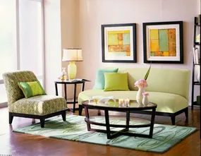

If you have a landscape that actually deserves attention, stop treating your windows like something to be hidden. Most homeowners fall into the trap of heavy, dark curtains or opaque blinds, turning a potential asset into a wall. This is a mistake. Your view is part of the architecture. It extends the room. It brings in light. It changes the mood of the space depending on the time of day. The goal isn’t just to see out. It’s to curate what you see and how you see it.
Choosing the Right Window Treatments
You don’t need to strip the windows bare. That’s not practical or always desirable. Privacy is a thing. So is heat control. The trick is layering. Start with a sheer. It filters light and offers a fuzzy veil of privacy without blocking the vista. Pair that with a lighter weight drape for when you need to shut out the world or the glare.
Consider materials that reflect light rather than absorb it. Silk blends or light linen catch the sun and cast soft shadows. They make the room feel bigger. If you’re dealing with direct sunlight, look for treatments with a UV coating. This protects your furniture from fading while keeping the view clear.
For a more modern approach, look into Roman shades. They stack up neatly when open, revealing the full frame of the window. They fold down smoothly to cover the glass. No bulk. No clutter. Just clean lines that respect the view.
Furniture Placement and Sightlines
Where you put your sofa matters more than you think. If your couch is facing a blank wall while the view is to the side, you’re ignoring your best feature. Rotate the seating. Face the window. If the view is too far away or not visually compelling enough to be the main event, angle the furniture at 45 degrees. This creates a diagonal sightline that draws the eye outward without making the room feel like a waiting room.
Keep the space in front of the window clear. Don’t block the glass with tall bookshelves or high-backed chairs. If you need storage, use low-profile units. Coffee tables should be slender. Legs visible. You want the eye to travel past the furniture and land on the horizon.
Lighting and Color Palette
The color of your walls should complement the view, not compete with it. If you have a forest view, go for greens or earth tones. If it’s a cityscape, neutrals or cool grays work better. Avoid colors that are too busy. Patterns can distract. Solid colors recede. They let the window do the talking.
Lighting plays a huge role in how the view is perceived at night. Instead of one bright overhead light, use ambient lighting. Floor lamps with upward-facing shades bounce light off the ceiling. It creates a soft glow that doesn’t wash out the darkness outside. You want to see the stars or the city lights, not the reflection of your own lightbulb in the glass.
Practical Considerations for Maintenance
Glass shows everything. Dust. Fingerprints. Bird droppings. If you have a large window, cleaning it becomes a task, not a chore. Use a squeegee. Microfiber cloths. Vinegar and water. Do it regularly. A dirty window ruins the view. It’s that simple.
Consider
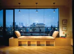

Frame the View Without Blocking It
Nothing kills a skyline faster than a bulky sofa right in front of the glass. If you are chasing that postcard shot of sparkling city lights at night, you need to get your furniture low. Think knee-height or lower. This keeps the sightline clear, letting the urban glow dominate the room instead of competing with a backrest.
An upholstered ottoman works wonders here. It’s flat, unobtrusive, and adds texture without taking up visual vertical space. A chaise lounge is another solid option, provided you position it perpendicular to the window. This setup creates a lounge spot that feels open, not enclosed.
The goal is minimalism. Keep the floor visible. Let the eye travel straight out. When you strip away the high-backed clutter, the view becomes the primary decor piece. You aren’t just looking at a window. You’re looking at a curated frame of the city.
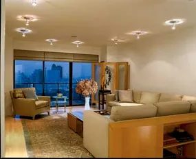

Window Treatment Strategy for Tall Seating
Push that tall chair to the side. Out of the direct path. You want the window clear, not cluttered by furniture legs or backrests. Keep side tables low. Small is better here. They shouldn’t compete with the view or block the light.
Privacy is your call. Some people want total transparency. Others need cover. If you go bare, you get maximum light. If you need shade, choose something that stacks away. Don’t let the treatment fight for space.
Roman shades are a solid pick. They look chic with almost any style. Clean lines. Soft folds when raised. Pleated shades work differently. They fit soft contemporary rooms. Or Asian-inspired spaces where minimalism rules. The key is unobtrusive stacking. When the shade is up, it should disappear. Not bulk up the wall.
Check the mounting. Tall chairs near windows can hit the hardware. Measure the chair height against the mount height. Leave room for the shade to lift fully. No dragging fabric. No snagging on the chair back. It’s about flow. Light in. Sightlines out. Furniture stays put.
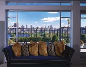

Mastering the Monochromatic Look
Modern decor isn’t just one thing. It shifts. It adapts. But one approach consistently delivers design success: the monochromatic scheme.
It’s not about being boring. It’s about depth.
When you strip away the color wheel’s chaos, you’re left with tone, texture, and light. This is where the real magic happens. A room dressed in shades of gray, for instance, doesn’t have to feel cold. With the right materials, it feels intentional. Curated.
Think about how you layer. Start with a base color. Paint the walls. Choose the sofa. Then, introduce variation through fabric. Velvet cushions. Wool throws. Linen curtains. Each absorbs light differently. Each creates a shadow. Each adds dimension to a single-hue palette.
Why does this work? Because it reduces visual noise. Your eye moves across the space without stopping at conflicting colors. It rests. It appreciates form over pigment.
Which materials stand out?
- Metals: Brushed nickel or matte black fixtures add edge.
- Wood: Warm oak tones ground a cool gray scheme.
- Glass: Reflective surfaces bounce light around, preventing flatness.
This is practical for the DIYer. You don’t need to match exact paint codes. You need to understand light values. Darker for depth. Lighter for airiness. Stick to one hue family. Any hue.
Does it limit creativity? No. It forces focus.
You start noticing things you otherwise miss. The grain in the floor. The weave in the rug. The way morning light hits the corner at 8 AM. These details become the decoration.
For more on building cohesive spaces, explore adjacent topics like cabin decor or country styling. These styles often borrow from modern minimalism but add rustic texture. Compare them to kitchen decorating ideas where functional monochrome surfaces can hide wear and tear effectively.
Window treatments also play a key role. Sheer fabrics in matching tones allow light control without breaking the color story. In bedrooms, this creates a restful environment. In home offices, it reduces distraction.
Bathroom spaces benefit similarly. Tile choices in varying shades of white or blue can create spa-like calm. Avoid stark white-on-white unless you want a clinical feel. Add texture through stone or wood-look tiles.
Dining rooms can feel formal with monochrome schemes. Soften them with natural fibers. A linen tablecloth in a slightly lighter tone than the chairs. A ceramic bowl in a deeper shade. Small accents break the monotony without introducing new colors.
It’s about control. You’re not decorating with color. You’re decorating with value.
This approach scales. Whether you’re refreshing a single room or planning a full home office renovation, the principle holds. Pick a color. Use its entire range. Layer textures. Let light do the work.
Success isn’t accidental here. It’s planned.
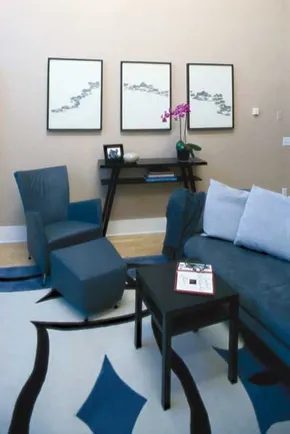

Why Blue Works as a Modern Neutral
Blue isn’t just a color. It’s a structural element in contemporary interiors. You treat it like gray or beige, but with actual depth. It cools down a room without flattening it. Think of it as a cool neutral that refuses to be boring.
The monochromatic approach is where this really shines. You aren’t throwing random shades at the wall. You are building a spectrum. Start with pale ice-blue. Let it breathe. Then introduce deeper indigos. Anchor the bottom with dark navy. It creates a gradient that feels intentional, not accidental.
Black and white act as the pivot points. Use black for hardware. Frames. The legs of a table. It cuts through the blue tones sharply. White keeps the airiness. It prevents the navy from feeling heavy or cave-like. The contrast is what gives the space its sleekness.
Japanese design principles fit here naturally. They share that value of serenity and clean lines. You don’t need a full zen garden. Just the attitude. Low-profile furniture. Natural wood tones that complement the cool blue. Minimalist art. The goal is simplicity. Remove the clutter. Let the color do the talking.
Blue functions as a cool neutral, but with much more personality.
When you mix these elements, you get a room that feels curated. It’s not just painted blue. It’s layered. The interplay between the lightest ice-blue and the deepest navy creates visual tension. It holds your eye. It keeps the space interesting without adding noise.
This works in any modern home. Whether you have an open-concept living area or a small study. The key is restraint. Stick to the palette. Trust the shades. The result is calm. It’s stylish. And it lasts.
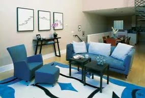

Balancing Softness and Structure
A rug with a bold, graphic pattern does more than just cover floorboards. It adds a youthful energy to a room without sacrificing any sense of order. This is the sweet spot for modern interiors. You aren’t locked into a sterile, museum-like vibe. The texture and color provide warmth.
This approach creates a space that is surprisingly versatile. You can host guests in casual blue jeans. Or you can dress up in black-and-white formal wear. Both work. The room adapts to you, not the other way around. It’s about comfort that doesn’t feel sloppy.
Modern design often gets a bad rap for being too cold. We think of hard edges, glass tables, and minimalism that feels more like an obstacle course. But that’s not the only way. The next step in this journey is proving that modern doesn’t mean uncomfortable. In fact, the best modern spaces are the ones you actually want to sink into.
Why Modern Comfort Matters
If you are renovating, you might feel pressure to go all-in on the “less is more” aesthetic. But living in a space requires softness. Think about the textiles. A high-pile rug absorbs sound. It feels good underfoot. It breaks up the visual noise of a sleek room.
This isn’t just about aesthetics. It’s about function. A room that feels too rigid becomes a showroom. No one wants to hang out there. By introducing graphic elements and soft textures, you create a home. A place where people linger. Where conversations flow. Where the design supports life, rather than competing with it.
What to Look For
When you are hunting for that perfect balance, keep your eyes open for specific details.
- Graphic Rugs : Look for patterns that are bold but not chaotic. Geometric shapes or abstract lines work well. They anchor the space.
- Textured Fabrics : Mix linen, wool, and cotton. Different textures add depth without adding clutter.
- Neutral Bases : Keep the large furniture pieces neutral. Let the rug or a single accent piece provide the visual punch.
This method allows you to change the mood of the room with minimal effort. Swap the pillow covers. Move the rug. The base remains clean. The character changes.
It’s not about following a rulebook. It’s about creating a space that feels intentional. A modern home should feel curated. But it should also feel lived-in. The graphic rug is just one tool in that toolkit. There are many ways to add comfort without losing the modern edge.
The key is restraint. Don’t overdo it. One statement piece is enough. Let it breathe. Let the rest of the room support it. That’s how you get the look without the fuss.

The Power of a Strong Base Color
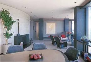
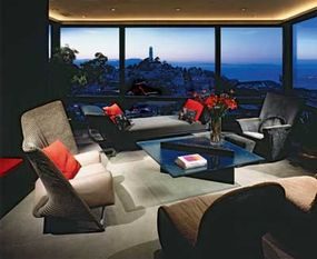
Start by looking at the foundation. If you strip away the expansive floor-to-ceiling windows that frame the city skyline, the room doesn’t collapse into blandness. It relies on a different kind of drama. Try painting the walls in cinnabar red. It is a bold, warm hue that commands attention without feeling heavy. The design remains sleek and contemporary, proving that interior impact isn’t solely dependent on the view outside. Day or night, the space stays eye-catching because of that deep, saturated color. It creates a knockout effect that works just as well in a windowless basement as it does on a high-rise penthouse.
Choosing the Right Coffee Table
The furniture needs to support this modern aesthetic without fighting for attention. A large coffee table is essential for functionality—there needs to be room for drinks, board games, and whatever else ends up in the center of the living area. But the material choice matters.
Opt for a top made of smoked glass. This specific material offers a light visual effect. Unlike clear glass, which can look sterile, or solid wood, which adds weight, smoked glass introduces a subtle darkness that grounds the room. It complements the cinnabar walls by adding a layer of cool, modern texture. The result is a space that feels comfortable and lived-in, yet distinctly polished.
Why This Combination Works
You might wonder why smoked glass is preferred over standard materials in this context. The answer lies in light management. In a room with large windows, glare can be an issue. Smoked glass reduces reflection while maintaining transparency. It allows the room to feel open but adds a touch of mystery. When paired with a strong wall color like cinnabar red, the table becomes a focal point rather than an afterthought.
Consider the practical aspects if you are planning a similar renovation:
- Durability : Smoked glass is generally more forgiving of fingerprints than clear glass, though it still requires regular cleaning to maintain its clarity.
- Style : This combination fits well within modern, minimalist, or industrial design schemes.
- Lighting : The color of the cinnabar red will shift depending on the time of day. Morning light might make it feel softer, while evening lighting will deepen the tone.
The goal is to create a space that feels intentional. Every element, from the wall color to the table material, should contribute to a cohesive look. It is not just about adding expensive furniture. It is about choosing materials that interact with light and color in specific ways.
The design remains sleek and contemporary, proving that interior impact isn’t solely dependent on the view outside.
This approach allows homeowners to create a striking environment regardless of the surrounding landscape. Whether you are dealing with a cramped urban apartment or a spacious suburban home, the principle holds: strong colors and thoughtful material choices can define a space. The smoked glass table acts as a bridge between the bold walls and the rest of the room, tying everything together with a cool, modern edge.
It is a simple shift in perspective. Instead of focusing on what you can see through the windows, focus on what you can see within them.

Mixing Formal and Casual Furnishings
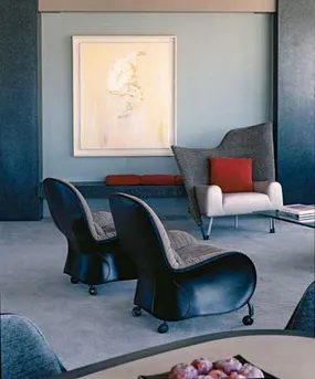
The room pulls off a tricky balancing act by clashing two very different aesthetics. You have plush, ultramodern seating designed purely for lounging. It isn’t stiff. It invites you to sink in. Tucked into this relaxed cluster is an unexpected chaise lounge that breaks up the seating arrangement.
Across the room, the dining chairs tell a different story. They look like office executive chairs. They have caster feet. They scream efficiency and mobility rather than cozy dinner parties.
Is it jarring? Maybe. But the contrast works. You get the sharp edge of professional design mixed with the homey warmth of soft fabrics. It proves you don’t have to choose between looking polished and feeling comfortable. The result is a space that feels intentional rather than accidental.

Finding Your Signature Style
Design isn’t about copying a catalog. It’s about making a space feel like yours. You want personality to leak out of every corner. Not just a trendy accent wall, but a home that reflects who you are.
Start by ignoring the rulebooks. Sure, there are principles. Proportion, scale, color theory. But rules are meant to be bent. Break them. If you love neon pink and industrial steel, don’t let some interior designer tell you it’s “too much.” It’s only too much if it doesn’t make you happy.
How to Inject Personality Without Clutter
You don’t need a museum to show off your taste. You need intention.
1. Curate, Don’t Collect
Walk through your home. Look at the objects. Does that vase remind you of that trip to Mexico? Does that painting make you laugh? Keep the ones that trigger a memory or an emotion. Toss the rest. Clutter hides style. Clutter is just visual noise.
“Your home should tell the story of who you are, and be a collection of what you love.”
2. Layer Your Textures
Flat surfaces feel sterile. Add depth. Mix rough with smooth. Matte with glossy.
– Wood: Raw, unfinished edges contrast nicely with polished metal fixtures.
– Fabric: Throw knits, linen cushions, velvet upholstery.
– Metal: Brass, copper, or matte black hardware.
These small touches create a tactile experience. It invites people to sit down. To stay.
3. Use Color as a Voice
Color sets the mood. But it doesn’t have to be all-over paint. Try it in unexpected places.
– The inside of a bookshelf.
– The back of a console table.
– A bold rug in a neutral room.
A pop of color acts like punctuation. It draws the eye. It creates a focal point.
Practical DIY Tips for Personal Touches
You don’t need to hire a pro to add character. Some of the best design elements are DIY.
Paint and Stain
– Furniture Flip: Take that thrift store dresser. Sand it down. Paint it a deep navy or crisp white. New brass knobs. Instant upgrade.
– Accent Walls: Don’t paint the whole room. Pick one wall. Use a stencil. Or a geometric tape pattern. It’s cheap. It’s removable. It’s bold.
Lighting is Key
Lighting changes everything. Harsh overhead lights kill mood.
– Layering: Use table lamps. Floor lamps. Pendant lights over the kitchen island.
– Warm Bulbs: Stick to 2700K-3000K bulbs. Cool white feels like a hospital. Warm white feels like a hug.
Art and Photos
– Gallery Walls: Mix framed photos, prints, and even mirrors. Vary the frame sizes. Mix black, white, and wood.
– Large Scale: One big piece of art can anchor a room better than ten small ones. It reduces visual clutter. It makes a statement.
Avoiding the “Showroom” Look
The biggest mistake homeowners make is treating their house like a model home. Too perfect. Too cold.
– **Leave Space
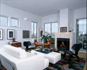

Overcoming the Modern White Shell
Let’s be honest. Walking into a modern white shell condo can feel less like entering a home and more like stepping into a hospital waiting room. The sterility is blinding. For most, it’s a blank canvas. For this architect, it was a challenge. The space demanded energy. It begged for color.
She didn’t fight the architecture. She weaponized it.
The goal wasn’t to hide the modern lines but to layer them with a deep, personal history. Her design philosophy is a specific blend: a respect for Japanese minimalism mixed with the chaotic beauty of family heirlooms and souvenirs from around the world. It’s not a showroom. It’s a life.
The Floor Strategy: Tatami Illusions
Here is the practical hurdle. Most condos have one non-negotiable rule. Carpet. It’s there to muffle sound between floors. You can’t install hardwood. You can’t lay stone.
The solution? A compromise that respects the building code while serving the aesthetic.
She chose plain khaki carpet. On paper, it sounds boring. Off paper, it works because it mimics the look and feel of Japanese tatami mats. The color is neutral. The texture is subtle. It provides a warm, earthy base that grounds the room without drawing attention to itself.
“The khaki carpet acts as the tatami, providing a neutral, textured foundation that allows other elements to shine.”
But a beige floor alone is still dull. Enter the drama.
Jewel-Tone Rugs as Art Pieces
Over that khaki base, she laid down rugs. Not just any rugs. These are dramatic, jewel-tone rugs from Tibet.
Think deep emeralds, royal blues, and rich burgundies. They pop against the neutral floor. They add weight. They add history. These aren’t mass-produced throw pillows; they are substantial pieces that anchor the room.
The effect is immediate. The floor becomes part of the art. The contrast between the minimalist khaki base and the vibrant, textured rugs creates a visual rhythm. It’s controlled chaos. It’s intentional.
Why It Works
This approach solves two problems at once. First, it satisfies the building’s soundproofing requirements without sacrificing style. Second, it allows for rapid stylistic updates. If the architect gets tired of the Tibetan rugs, she can swap them out. The khaki base remains. The shell remains. The personality changes.
It’s a reminder that you don’t need to tear up floors to make a space yours. Sometimes, you just need the right rug. And a little courage to ignore the white walls.
The result is a space that feels collected, not curated. It breathes. It has layers. And it looks nothing like the unit it once was.
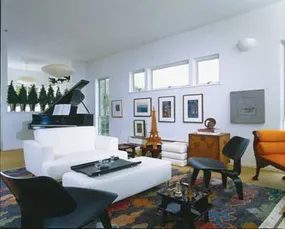

White walls do more than just reflect light. They act as a blank canvas, making the owner’s colorful Japanese prints pop with intensity. This is where eclectic style stops being a buzzword and starts looking like a life. You get modern furniture in crisp white and sharp black. Then you throw in traditional pieces bathed in warm hues. The contrast works. It creates tension without chaos.
Industrial spaces are natural candidates for this kind of modern decor. The raw materials—brick, steel, concrete—already have character. You don’t need to fight the architecture. You just need to layer it. If you’re looking to transform a loft or a converted warehouse, start by asking yourself what the space already says. Does it shout loud? Or does it whisper?
Balancing Raw and Refined
The key is balance. Too much industrial can feel cold. Too much traditional can feel stuffy. Find the sweet spot.
- Start with the base. Keep walls neutral. White or light gray lets the art and furniture take center stage.
- Introduce contrast. Use black metal fixtures or dark wood to ground the space.
- Add warmth. Textiles in earth tones soften the hard edges of exposed pipes or beams.
- Curate art carefully. Large-scale prints or bold colors break up the monotony of neutral walls.
This approach doesn’t require a huge budget. It requires intention. You’re not just filling space. You’re creating a narrative. The Japanese prints aren’t just decoration. They’re a statement. They say, “I appreciate craftsmanship.” The modern furniture says, “I value function.” The traditional pieces say, “I respect history.” Together, they tell a story.
Why Industrial Spaces Work for Eclectic Style
Industrial buildings were designed for utility, not aesthetics. That’s why they feel so adaptable. High ceilings offer room for large artwork. Exposed ductwork adds visual interest without extra cost. Large windows bring in natural light, which is essential for showcasing vibrant colors.
When you dress up an industrial space, you’re not erasing its past. You’re honoring it by making it livable. This isn’t about hiding the pipes. It’s about integrating them into the design. Paint them a contrasting color. Use them as shelves. Let them frame a view.
Practical Steps for Homeowners
If you’re tackling this yourself, start small. Don’t try to redo the whole space at once. Pick one room. One corner. See how it feels.
- Clear the clutter. Industrial spaces can feel cavernous. Empty space can feel lonely. Fill it intentionally.
- Choose a focal point. A large piece of art. A unique sofa. A statement light fixture. Build around it.
- Layer textures. Mix smooth metal with rough wood. Soft wool with hard concrete. Texture adds depth.
- Use lighting strategically. Layer ambient, task, and accent lighting. Avoid overhead lights alone. They can make spaces feel flat.
Remember, style is personal. There’s no right way to mix eras or materials. The goal is to create a home that feels like you. Not a showroom. Not a museum. A place where you live.
“The best homes don’t look like they were decorated. They look like they were discovered.”
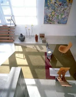

Balancing Industrial Rawness with Living Space
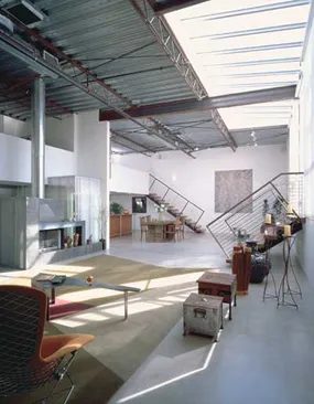
Most people assume loft conversions in former industrial buildings mean sacrificing comfort for aesthetics. This California project proves otherwise. The building itself started as a warehouse, now housing ground-floor art galleries and artist lofts above. The design team didn’t try to hide the building’s history. They leaned into it.
Polished concrete floors are the foundation. They stay cool, look clean, and require little upkeep. That is a practical choice for high-traffic areas. Walls are plain painted drywall. No trim. No crown molding. Just flat, clean surfaces that reflect light. This simplifies the maintenance routine significantly. If you are tackling a DIY paint job here, expect large, uninterrupted stretches of wall.
The roof structure is exposed. Steel trusses and metal decking are visible from the floor below. This is not just for style. It adds vertical volume to the space. You feel the height. It compensates for the lack of windows. Many industrial lofts suffer from poor natural light. Here, the open volume creates a sense of airiness anyway.
Strategic Zoning in Open Plans
Sleeping quarters are stacked. They sit directly above the kitchen and bathroom. This vertical stacking keeps the main floor completely open. You can host a large gathering without worrying about clearing furniture. The layout supports high-energy social events. There is room to move. There is room to breathe.
The kitchen and bath are functional. They are tucked away but accessible. The rest of the loft remains free. This approach maximizes square footage for living. It minimizes wasted hallways or unused corners. You get more space for what matters.
Why This Works
The stripped-down modern style reduces visual clutter. Fewer materials mean fewer surfaces to clean. Polished concrete resists stains. Painted drywall is easy to touch up. Exposed steel requires no maintenance. This is low-effort living. It suits busy professionals or artists who need space for creation.
Safety is straightforward. No tripping hazards from rugs or clutter. The open floor plan allows for clear sightlines. You can see across the entire space. This is useful for supervising children or pets. It also makes the area feel larger than it is.
Materials and Tools for DIY Enthusiasts
If you are considering a similar renovation, start with the floors. Polished concrete is durable. It can be stained or left natural. You will need a diamond grinder and sealing equipment. This is heavy-duty work. Consider hiring a pro for the initial polish. You can maintain it yourself with regular sealing.
Drywall installation is standard. Use moisture-resistant board in the bathroom area. This prevents mold growth in humid conditions. Paint with a matte or eggshell finish. It hides imperfections better than gloss.
Steel trusses are structural. Do not alter them. They support the roof. If you need to run electrical or plumbing, route it through the metal decking above. This avoids cutting into the trusses. It keeps the aesthetic intact.
The result is a space that feels modern without feeling sterile. It is warm because of the materials. It is inviting because of the openness. You can host parties. You can work from home. You can live in peace. The design supports both.
“The goal was to create a sense of airiness despite having few exterior windows.”
This balance is hard to achieve. It requires
Decorating a modern home isn’t just about the big furniture pieces. It’s about the small things that tie everything together. Accessories make the difference between a showroom and a place you actually want to live.
Find the Right Pieces
You don’t need to buy a new set of everything. Start with a few key items that reflect your style. Look for pieces that add texture and interest. This could be a bold vase, a stack of art books, or a unique mirror. The goal is to create a space that feels curated, not cluttered.
“Accessories are the jewelry of the room.”
Where to Look
Check out local thrift stores for one-of-a-kind finds. Online marketplaces are great for specific items. Don’t ignore the big box stores. They often have affordable options that work well in modern settings. The key is to mix high and low. A cheap pillow can look expensive in the right fabric.
Types of Accessories
Here are some ideas to get you started:
- Artwork : Large pieces can make a statement. Small galleries can add personality.
- Textiles : Rugs, curtains, and throws add warmth. Choose neutral tones for a modern look.
- Lighting : Lamps and sconces can change the mood of a room. Consider smart lighting for flexibility.
- Plants : Greenery brings life to a space. Choose low-maintenance options if you’re busy.
- Objects : Sculptures, bowls, and trays can add visual interest.
Avoiding the Clutter Trap
It’s easy to overdo it. Start with a few pieces and add more over time. Less is often more in modern design. Make sure each item has a purpose. If it doesn’t add value, let it go.
Mixing Styles
Don’t be afraid to mix modern with other styles. A rustic wooden tray can look great on a sleek glass table. The contrast can be interesting. Just make sure the colors and materials work together.
Final Thoughts
Accessorizing is a personal process. Take your time. Experiment with different layouts. The right accessories can transform a room from boring to brilliant.
For more inspiration, check out these guides:
-
Cabin Decor
-
Country Decorating Ideas
-
Decorating Ideas
-
Window Treatment Ideas
-
Kitchen Decorating Ideas
-
Dining Room Decorating Ideas
-
Bedroom Decorating Ideas
-
Bathroom Decorating Ideas
-
Home Office Decorating Ideas
-
Home Spaces
-
Interior Decorating
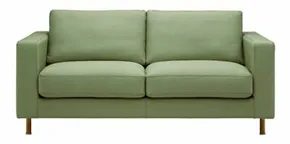

Striking the Right Tone in Modern Spaces
Modern design often gets a bad rap for feeling cold or sterile, but that doesn’t mean you have to sacrifice personality for style. The trick is balancing urbane aesthetics with genuine comfort. You can have that sleek, sophisticated look without your home feeling like a showroom nobody is allowed to touch.
Start with your palette if you’re unsure where to begin. Pale neutrals provide a calm, expansive backdrop. Add sharp black accents for definition and contrast. This combination keeps things grounded and stylish.
Another approach is to let a graphic rug lead the charge. Pick a rug with bold, dramatic patterns. Use its existing colors to build the rest of your room’s scheme. It’s an easy way to inject energy without overthinking every single element.
Comfort Meets Clean Lines
Furnishings should do more than just look good. They need to support your daily life. Choose pieces that offer home-style comforts while maintaining a modern silhouette. Think plush fabrics on clean frames. Or minimalist structures with deep, inviting cushions.
This balance prevents the space from feeling too rigid. You get the visual impact of modern decor. But you also get the warmth needed for actual living. It’s about creating an environment that feels curated, not cramped.
Practical Steps for Your Scheme
- Choose a Neutral Base: Stick to whites, grays, or beiges for walls and large furniture. This keeps the space airy.
- Add Black Accents: Use black in lighting, frames, or hardware. It sharpens the look.
- Use a Rug as Inspiration: If you love a specific rug’s colors, pull those shades into pillows or art. It ties the room together instantly.
This method works because it’s flexible. You can change small details without redoing the whole room. The base stays constant. The accents shift with your mood.
“Just reach for furnishings that express your urbane style while offering home-style comforts.”
It’s not about picking one extreme. It’s about merging the two. You want guests to notice the style. But you want yourself to enjoy the ease. That’s the real goal.
Which route feels more like you? The stark contrast of black and white? Or the layered warmth of a patterned rug? Either way, the key is intention. Don’t just fill space. Fill it with things that matter.
The line between chic and cozy is thinner than you think. Walk it carefully.


Choosing the Right Foundation
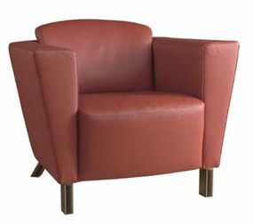
Start with the heavy hitters. You need furniture that holds its own against the urban chaos but keeps you comfortable. Leather is the obvious move here. It’s tough, it ages well, and it fits that “tough-and-tender” aesthetic that defines the city lifestyle. Don’t be afraid to pull in fresh colors. A bright, unexpected hue breaks up the seriousness of dark leather and makes the space feel alive.
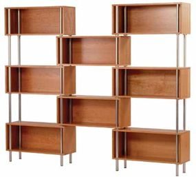
Next, tackle the clutter. You can’t live in a mess, no matter how stylish your sofa is. Invest in storage solutions that are actually inventive. Not just generic boxes, but pieces that solve specific problems. If you have a niche in the hallway, find a slim console. If your coffee table is too small, look for nesting tables. The goal is control. Everyday junk needs a home where it can disappear when guests arrive and reappear when you need them.
Mastering the Entertaining Setup
There is one non-negotiable rule for gracious entertaining: every guest must have a place to set their drink.
A table within reach of every seat.
This isn’t just about convenience. It’s about preventing spills and keeping conversation flowing. If someone has to balance their cocktail on their knee, the party dies. You need cocktail tables and end tables strategically placed.
Check your floor plan. Look for the gaps between sofas and armchairs. That’s where your artful cocktail tables go. They should be close enough to touch but far enough to not be an obstacle. The ones shown in the reference photos work because they serve double duty. They provide surface area without dominating the room.
Consider the height. Your side tables should align roughly with the arm of your seating. This creates a visual line that guides the eye and makes the layout feel intentional. If you’re mixing styles, stick to one material family—like all metal or all wood—to keep it from looking chaotic. The variety in shape adds interest, while the shared material grounds the look.
Don’t overlook the smaller surfaces. A tray on a larger table can create a temporary “island” for drinks if you’re short on space. It’s a hack, but it works when you’re hosting a crowd in a compact apartment. Just make sure the tray is stable. Nothing kills the mood faster than a wobbly drink holder.
Think about the traffic flow. Can you walk behind a guest without bumping their elbow? If not, move the table. Or move the chair. The furniture should breathe. Give it room to function.
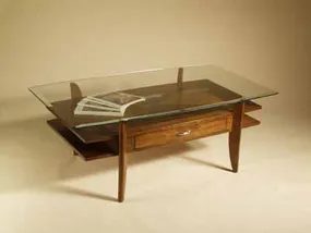

Lamps and accessories aren’t afterthoughts. They are the finishing touch that defines a room’s modern aesthetic. Pick designs that align with your specific style. It doesn’t matter if you live in a sprawling loft or a cramped condo. The living room is where you should pull out all the stops.
This is the social hub. The kitchen is the mechanical heart of the home. The dining room brings everyone together. These two spaces require decor that supports both function and flow. You need ideas that work for cooking and dining.
Prioritizing Function Over Fluff
Modern design in these rooms isn’t just about looking cool. It’s about utility. A cluttered counter kills the vibe. Start with clean lines. Choose lighting that actually illuminates the workspace. Pendant lights over an island or dining table do double duty. They provide focus for chopping vegetables and set the mood for evening wine.
Don’t just buy lamps because they are trendy. Buy them because they reinforce your modern sense of style. If your kitchen feels sterile, add texture. A woven basket for bread. A matte black faucet. Small touches matter more than expensive furniture in tight spaces.
Integrating Cooking and Dining Spaces
The kitchen and dining room often blend. Open floor plans make this seamless. Or they force you to create distinct zones. Either way, continuity is key. If your kitchen has cool tones, your dining area shouldn’t feel like a different planet. Match materials. Wood floors should flow into the dining space. Tile backsplashes might echo in a rug pattern.
You want the spaces to feel connected but distinct. The kitchen handles the mess. The dining room handles the social. Decor should reflect that division. Use table runners that are easy to wipe. Keep kitchen decor durable. Ceramic can crack. Glass can shatter. Choose items that can survive a chaotic dinner rush.
Where to Find More Inspiration
If you need more ideas for specific rooms, look into these areas:
-
Cabin Decor
-
Country Decorating Ideas
-
Decorating Ideas
-
Window Treatment Ideas
-
Kitchen Decorating Ideas
-
Dining Room Decorating Ideas
-
Bedroom Decorating Ideas
-
Bathroom Decorating Ideas
-
Home Office Decorating Ideas
-
Home Spaces
-
Interior Decorating
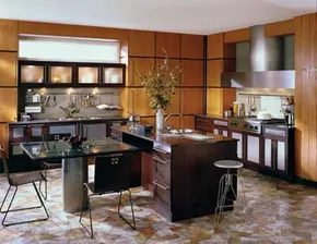

The kitchen isn’t just a place to heat up leftovers anymore. It’s the center of gravity. For years, interior designers have pushed the dining room into exile, but the pendulum is swinging back. You don’t need a formal ballroom to host dinner parties. You just need an eat-in kitchen. Or better yet, a dedicated nook that feels intentional, not accidental.
In industrial loft conversions, you’re often starting from zero. No previous owner’s taste to fight. But that openness is a double-edged sword. You have the space, but you lack the definition. That’s where the renovation gets tricky.
If you’re working with an older city apartment, the stakes are higher. Moving plumbing and electricals in a walk-up building? It’s a logistical nightmare. But the payoff is immense. A modern kitchen adds value. It adds life. It adds square footage to the actual living space, not just the theoretical “living area” that never gets used.
Upgrading the Core
Don’t tear out everything. Look at what’s already there.
Those skimpy doorways? Remove them. Open sightlines make small spaces feel larger. But keep the charm. Original hexagonal tiles? Yes. They’re durable and visually interesting. Don’t cover them with cheap vinyl unless you hate history.
Appliances, though. Those need a refresh. Old fridges eat energy. They make noise. They look dated. Swap them for energy-efficient models. The upfront cost is high, but the monthly savings add up. Plus, modern appliances integrate better with smart home systems. You can monitor temperature. You can run cycles remotely. It’s practical luxury.
Defining the Dining Space
If you don’t have a separate dining room, create one.
A large table anchors the room. It becomes the hub. Even in an open-plan loft, a substantial piece of furniture draws the eye. It signals, “This is for eating. This is for talking.”
If you do have a dining room, widen the doorway. Make it an arch. Or remove it entirely. Blend the kitchen and dining zones. The flow matters more than the walls.
Color plays a huge role here. Try a deep cardinal orange-red on one wall. It’s not for the faint of heart. It’s bold. It’s warm. It’s been a favorite since the Renaissance for a reason. Red stimulates appetite. It creates intimacy. In a large, cold industrial space, it adds heart.
The Luxury Angle
A big kitchen allows for excess. Not clutter. But space.
You can island. You can double islands. You can have a prep station separate from the cooking zone. This is where modern decor shines. Clean lines. Matte finishes. Hidden storage. The goal is to make the kitchen look effortless. But achieving that effortlessness takes work.
It takes planning. It takes budgeting. It takes knowing when to splurge and when to save.
“A kitchen renovation isn’t simple, especially in elevator and walk-up buildings, but it’s almost always worthwhile.”
The trick is balancing the industrial skeleton with soft, inviting textures. Metal counters against warm wood. Concrete floors against plush rugs. The contrast keeps it from feeling like a warehouse.
Next Steps
If you’re ready to dive deeper, look into specific design styles.
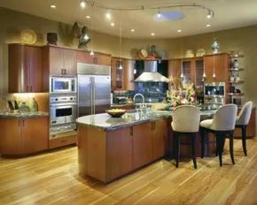
Defining the Center of a Large Open Plan Kitchen
When you are dealing with a kitchen that spills out into the living area, standard cabinetry won’t cut it. You need a layout that anchors the space without boxing it in. This is where the scale of the room demands a centerpiece that actually works.
Take a massive work island as your starting point. It needs to be big enough to handle serious prep but styled enough to hold up as a design statement. Here, variegated granite tops the island. It’s not just durable; it brings in natural patterns that break up the monotony of large, open floor plans.
But a slab of stone is only half the story. To make this island functional for entertaining, you add a slim, glass tier to the side. This creates a dedicated snack bar. It’s a simple addition that changes the dynamic entirely. Guests can perch there. They can watch the cook without getting in the way. It turns a workspace into a social hub.
The surrounding storage needs to match this level of intention. The cabinetry here avoids sharp corners. Instead, the edges are rounded. This softens the lines and nods to Art Deco influences. It’s sleek. It’s modern. But it lacks the heavy, retro feel you might expect from that style. It’s subtle.
Lighting does the heavy lifting to tie it all together. You need more than just overhead recessed lights. The sparkle comes from a mix of fixtures. Some are tucked into the ceiling. Others run along a curved track. This layering adds depth. It highlights the texture of the granite and the gloss of the glass.
The result is a kitchen that feels spectacular. Not because it’s flashy, but because every element serves a purpose. The materials are luxurious. The accents are deliberate. It’s a space designed for living, not just cooking.
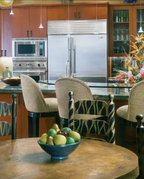
The trend of floor-to-ceiling cabinets might dominate modern kitchens, but there is a quiet rebellion happening in traditional spaces. This kitchen chooses not to hide its upper limits behind soffit boxes or endless shelving. Instead, it leaves the space above the cabinets open. That void isn’t empty. It is a stage for large, dramatic accessories. The scale matches the room. If the space feels grand, the objects on top should too.
Why Open Space Above Cabinets Works
Leaving room above your upper cabinets changes the dynamic of the entire kitchen. It breaks up the visual weight. Without that top-heavy block of wood, the room feels lighter. It also offers a chance to display items that don’t belong in the daily workflow. Plates. Bowls. Collections. Things you care about but don’t need to grab every morning.
But the most powerful tool in this equation is color. A neutral kitchen can feel sterile. It can feel like a showroom. Color adds spice. It adds personality. And it works in kitchens of all sizes. You don’t need a sprawling island to justify a bold hue.
Adding Bold Color to Your Kitchen
If you are ready to move beyond beige and white, you have options. Paint is the most obvious choice. But you can also look at backsplashes. Cabinetry. Even appliances.
1. Paint the Cabinets
This is the biggest change you can make. It requires prep work. Sanding. Priming. Painting. But the result is transformative. Go for a deep navy. A forest green. A crisp black. These colors ground the space. They make the white countertops pop. They create contrast that feels intentional, not accidental.
2. The Backsplash as a Statement
If you aren’t ready to paint cabinets, start with the backsplash. Subway tile is safe. But why be safe? Try patterned tile. Zellige tile with its irregular surface. Hand-painted Mexican tiles. A mosaic that draws the eye. This is a smaller project. It involves more grout work, yes. But it doesn’t require removing cabinets.
3. Bold Island
Keep the perimeter cabinets neutral. Paint the island a contrasting color. This draws attention to the center of the room. It creates a focal point. It makes the kitchen feel like it has a heart.
4. Accessorize with Color
You don’t have to commit to a full paint job. Start small. A bright rug. Colorful dishware. A vivid vase. These items are easy to change. If you get tired of red, switch to blue. It’s low-risk. High reward.
“Color is not just decoration. It is mood. It is energy. It is the difference between a kitchen that is merely functional and one that is alive.”
Practical Considerations
When adding color, think about the rest of the house. Does this kitchen flow into the living room? A bold color here might feel jarring if the adjacent space is muted. Consider the sightlines. What do you see when you walk into the home?
Also, think about light. Dark colors absorb light. If your kitchen is north-facing, it might already feel dim. A dark cabinet could make it cave-like. Test samples. Live with them for a few days. Observe them in the morning light. In the afternoon. At night with the under-c
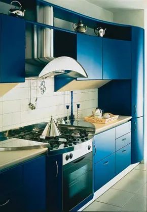

Why Cobalt Blue Works in Minimalist Kitchens
Neutral palettes can feel sterile. Cold. Like a showroom that no one actually lives in.
That is where cobalt blue kitchen design steps in. It is not just a splash of paint. It is an emotional anchor. When you strip away the clutter in a modern-decor kitchen, you are left with hard lines and empty space. Without intervention, that space feels dead.
Cobalt blue changes the temperature.
It pulls the eye. It creates depth. It makes the white cabinets look brighter and the stainless steel appliances pop with contrast. The result is a room that feels curated, not empty.
How to Apply Cobalt Blue Without Overwhelming the Space
You do not need to paint the entire room in primary blue. That is a mistake. Instead, use it strategically.
- Backsplash: Subway tiles in cobalt blue offer texture and history in a modern setting.
- Cabinetry: One island in blue against white perimeter cabinets creates a focal point.
- Accessories: Bar stools, pendant lights, or a large rug can introduce the hue without commitment.
The key is intention. A little goes a long way. Too little, and it disappears into the gray. Too much, and it becomes chaotic.
The Psychology of the Choice
Why this color? Blue is calming. It is associated with water and sky. In a room where you chop, stir, and serve food, that calmness matters. But cobalt is not pastel. It is bold. It demands attention.
It signals confidence.
If you are considering a renovation, ask yourself if your current palette feels safe or stagnant. Safe is easy. Safe is forgettable. Cobalt blue is not safe. It is alive.
Practical Considerations for DIYers
Painting cabinets is a project. It requires sanding, priming, and multiple coats. Cobalt blue, specifically, can show brush strokes easily.
- Use a high-quality enamel.
- Sand between coats.
- Consider spray painting for a smoother finish on flat surfaces.
If you are not ready to repaint, swap out hardware. Knobs and pulls in cobalt blue enamel or glass are cheap fixes with high impact.
The color stays. The feeling changes.
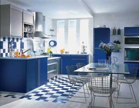
Why Bold Paint Choices Define Your Space
You don’t need to whisper when you can shout.
Pick a hue that stops traffic. Whether you are chasing that airy, expansive vibe or a cozy, cave-like intimacy, paint is the fastest lever you can pull. It changes the physics of a room without moving a single wall.
Most people play it safe. Beige. Greige. The endless spectrum of “neutral.” But color does more than cover drywall. It alters perception. A deep navy makes a high ceiling feel lower, more grounded. A bright white reflects light, pushing walls back. You are manipulating volume with pigment.
Choose your bold color. Then commit.
Half-measures in paint look like accidents. A bold shade demands confidence. It’s not about following trends. It’s about how the light hits the corner at 4 PM. How the shadows fall when the sun dips.
If you want the room to feel huge, go light. If you want it to feel like a hug, go dark. The trade-off is simplicity. You buy a can. You roll it on. You wait for it to dry. The rest is psychology.
Which boundary are you ready to break?
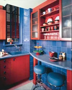

European aesthetics bring a specific kind of polish to the kitchen. It is not just about looks. It is about clean lines, high-end materials, and a sense of order that feels expensive without being loud. If you are looking to upgrade your space, this style offers a blueprint for world-class results.
The appeal of European minimalism
Why do so many homeowners chase this look? Because it reduces visual clutter. A sleek kitchen relies on what you hide as much as what you display. European design prioritizes integrated appliances. Think refrigerators that blend into cabinetry. Dishwashers with panel-ready fronts. The goal is a unified facade.
Materials matter. Matte finishes often work better than glossy ones for hiding fingerprints. But high-gloss lacquer is still a staple for that mirror-like reflection. It bounces light around a small room. It makes spaces feel larger.
Choosing the right palette
Color dictates the mood. European kitchens often stick to neutrals. White. Black. Gray. Natural wood tones. These shades create a calm backdrop. They allow the architecture of the room to take center stage.
You can introduce color through hardware or backsplashes. But keep it subtle. A monochromatic scheme feels more sophisticated than a rainbow of accents. If you want drama, go for a deep navy or charcoal cabinet. Pair it with brass or matte black fixtures. The contrast should be sharp, not muddy.
Hardware as jewelry
In a room stripped back to basics, the hardware becomes the jewelry. Handles and knobs are no longer afterthoughts. They are focal points.
For a truly modern look, consider handle-less cabinets. Push-to-open mechanisms create that seamless, sleek appearance. If you prefer visible hardware, choose thin, linear pulls. Avoid ornate, vintage styles unless you are going for a specific transitional look. Stick to simple geometric shapes.
Lighting and ambiance
Lighting transforms the atmosphere. Recessed ceiling lights are standard for general illumination. But task lighting is where the design shines. Under-cabinet LED strips provide function and mood. They light up the countertop without casting shadows on your prep work.
Pendant lights over an island add vertical interest. Keep them simple. Linear fixtures work well over long counters. They reinforce the horizontal lines of the room.
Practical steps for the DIYer
If you are tackling this yourself, start with the cabinetry. Sanding and painting old boxes can yield great results. Use a high-quality primer. Multiple thin coats are better than one thick one. It prevents drips and ensures a smooth finish.
Install new hardware carefully. Measure twice. Drill pilot holes to avoid splitting the wood. If you are removing old cabinets, be mindful of plumbing and electrical lines behind the walls.
Where to find inspiration
This style is versatile. It works in urban apartments and suburban homes. You can mix elements from different European regions. German engineering brings precision. Italian design brings warmth. Scandinavian style brings light and airiness.
World-Class Glamour
The term “glamour” here does not mean gold leaf and crystal chandeliers. It means perfection in execution. It means every joint is tight. Every surface is flawless. It is the confidence of a space that is both beautiful and highly functional.
To achieve this level of finish, attention to detail is non-negotiable. Check your
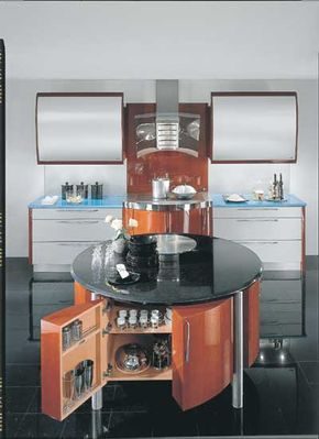

The High-Gloss Modern Kitchen
European cabinetry doesn’t just sit in a room. It commands it. High-gloss finishes are no longer a niche trend for ultra-modern kitchens. They are a dominant design language that blends fearless aesthetics with startling beauty. The result is a space that feels less like a kitchen and more like a polished extension of the self.
Wood and wood veneers play a starring role here. They are coated in lacquer so thick and shiny it reflects light like a mirror. This finish highlights the natural grain of the timber. It doesn’t hide the material. It celebrates it. You see the swirls and lines clearly, frozen in a glass-like surface.
This look rarely stands alone. It pairs with other highly polished materials. Granite countertops add weight and texture. Glass shelves introduce transparency. Stainless steel appliances provide industrial strength. Together, they create a sparkling, ultramodern aesthetic. It is about function. It is about durability. It is about sparkle.
You can replicate this effect without a full renovation. Start with the surfaces. Glossy black ceramic tiles offer a sleek, low-maintenance backsplash. They absorb light, making the surrounding shiny elements pop. Glass mosaic tiles add intricate detail to smaller areas. Think backsplashes or accent walls. They catch the eye and break up large, flat surfaces.
Glass serving pieces extend the theme to your daily routine. Clear glass platters and bowls reflect the overhead lighting. They make food presentation look crisp and clean. Pair them with stainless steel cookware. The shine is consistent. The look is cohesive.
The key is balance. Too much gloss can feel cold. Too little can look dated. Choose your materials carefully. Ensure the finishes complement each other. Wood warms the space. Metal cools it. Glass connects them.
“It’s all about function, strength, and sparkle.”
This isn’t just about looking good. It’s about creating a space that feels modern and intentional. Every element has a purpose. Every surface reflects something. Whether you are replacing a backsplash or choosing new cabinets, aim for that high-impact, high-shine look. It’s bold. It’s clean. It’s unmistakably contemporary.
Does your kitchen need more light? Or just more reflection? The answer might lie in the finish you choose.
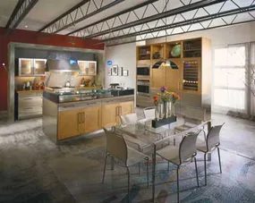

When square footage is at a premium, design stops being about decoration and starts being about survival. You aren’t just arranging furniture; you are engineering a living environment. Modern decor isn’t just a aesthetic choice here. It is a functional necessity.
The Case for Modern Minimalism
Why do small spaces respond so well to modern styles? It isn’t just about looking sleek. It is about visual weight. Traditional styles often come with bulky frames, ornate carvings, and heavy textures that swallow light and air. Modern design strips that away.
Think about the materials. Glass tables. Acrylic chairs. Open shelving. These choices allow light to pass through the room rather than bouncing off solid oak or velvet curtains. The result is a sense of airiness that physical size simply cannot provide.
“In small spaces, negative space is as important as the objects you choose to fill it.”
Vertical Living
When you cannot expand outward, you go up. This is where modern storage solutions shine. Floor-to-ceiling cabinets are not just trendy. They are essential. They draw the eye upward, creating an illusion of height while providing maximum storage in a minimal footprint.
Look for units with sliding doors instead of swinging ones. A swinging door needs clearance. It eats up floor space that could be used for circulation. Sliding doors hide clutter without stealing usable area.
Multi-Functional Furniture
You do not have room for a dedicated dining table and a dedicated workspace. So, you need pieces that wear multiple hats.
- Drop-leaf tables: Fold them down when not in use. Store them against a wall.
- Sofa beds: A necessity in studios, but choose one with a sturdy frame. Cheap foam collapses.
- Ottomans with storage: They serve as footrests, extra seating, and a hiding place for blankets.
The key is versatility. Every item in an ultra-small apartment must earn its keep. If a chair only looks nice but never sits anyone, it is a liability.
Color and Light
Dark colors can make a room feel cozy, but they also shrink it. Modern design often leans toward lighter palettes. Whites, grays, and soft neutrals reflect light. They make walls recede.
But don’t go sterile. Add texture. A woven rug. A knit throw. These add warmth without adding bulk. They break up the monotony of white walls without visually cluttering the space.
Lighting matters too. Avoid a single overhead fixture. It creates harsh shadows and dead zones. Use layered lighting. Floor lamps in corners. Table lamps on side tables. LED strips under shelves. This creates depth. It makes the room feel larger than its physical boundaries.
The Open Concept Trap
Open concept sounds great until you actually live in a studio. Without walls, noise travels. Smells travel. Privacy becomes a myth. Modern design addresses this with subtle dividers.
- Frosted glass partitions: They let light through but block visibility.
- Bookshelves as walls: Place them perpendicular to a wall. They define the space without blocking the view entirely.
- Rugs: Use a rug to anchor a seating area. It psychologically separates the zone from the sleeping area.
Mindful Clutter Control


Maximizing Light in an 800 Sq Ft SF Apartment
The challenge here wasn’t just fitting furniture into an 800-square-foot footprint. It was fighting the inherent gloom of a second-home apartment in San Francisco. The original layout was tight. Views were nonexistent. So the designer didn’t try to hide the small rooms. They leaned into it.
Bright colors became the structural support. Cobalt blue. Yellow. Violet. Red. These aren’t subtle accents. They are the energy source for the space.
Why does this work in a small city unit? Light doesn’t just come from windows. In apartments with poor sightlines, you need artificial vibrancy to trick the eye into feeling spacious. White walls act as the anchor. Too much color and it feels chaotic. Too little and it feels like a box. The balance here is sharp.
The result is a modern-decor style that refuses to be quiet. It’s loud, but controlled. Every hue vibrates against the white backdrop, creating a sense of depth that square footage alone can’t provide.
If you’re looking to revitalize a similar small rental or condo, consider how color can replace natural light. You don’t need a view. You need contrast.


Balancing Sleek Surfaces with Human Scale
Modern design often gets a bad rap for feeling like an airport terminal. Cold. Sterile. Impersonal. But you don’t have to choose between sharp lines and a place where people actually want to gather. The trick isn’t to soften the edges of modernism but to layer texture deeply into it. This is about creating sophistication without sacrificing warmth.
Start with the big planes. Cabinets in high-gloss white or matte charcoal look incredible, but they reflect light in a way that can flatten a room. Break that reflection. Introduce materials that catch the eye and the hand. Think wide-plank oak flooring with a visible grain. Even if you stain it light, the texture remains. It grounds the space.
Then, look at the countertops. Quartz and engineered stone are popular for their durability and clean look, which fits the modern aesthetic perfectly. But a slab of white quartz alone can feel clinical. Counterbalance it with an island clad in textured stone or even live-edge wood. The contrast does the heavy lifting. It tells the eye that this is a functional space, not just a display case.
Lighting is where most people stumble. Modern kitchens often rely on recessed cans, which create uniform, flat illumination. It’s efficient, sure. But it’s not inviting. Replace some of those with statement pendants over the island or under-cabinet task lighting that casts a warm glow downward. A 2700K to 3000K bulb temperature is your friend here. It mimics the warmth of incandescent bulbs rather than the harsh blue-white of fluorescent or cool LED lights.
Don’t forget the backsplash. Subway tile is a classic, but try it in a herringbone pattern or use a material like zellige tile, which has inherent variation in its glaze. The slight irregularities in handmade or artisanal tiles add depth that flat, machine-made ceramic lacks. It introduces a subtle imperfection that feels human.
For hardware, go slim. Long, linear pulls in brushed brass or matte black look sharper than bulky knobs. They emphasize the horizontal lines of the cabinetry. But again, texture matters. Brushed finishes hide fingerprints better than polished chrome and add a tactile quality that shiny metals lack.
Plants are the easiest way to inject life. A single, large potted plant in the corner—like an olive tree or a fiddle leaf fig—breaks up the rigidity of straight lines. It’s not about having a jungle. It’s about that one organic shape disrupting the geometry.
Finally, consider the sound. Hard surfaces in a modern kitchen—stone, glass, metal—can make a room echo. This adds to the cold feeling. Introduce softness through rugs. Yes, rugs in the kitchen. A flat-weave rug under a seating area or near the sink can dampen noise and add a layer of color and pattern. It defines a zone without closing it off.
The goal is to create a kitchen that looks crisp in a photograph but feels lived-in the moment you walk through the door. It’s a balance. A slight tilt toward the warm side keeps it from feeling like a showroom. You’re not just decorating. You’re curating an atmosphere.
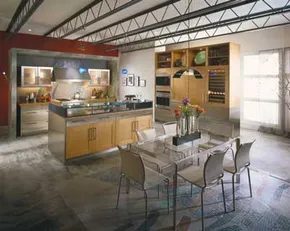

Blending Industrial Edge with Homey Warmth
Most people default to stainless steel. It’s safe. It’s shiny. It looks like a restaurant. But a truly modern kitchen needs more than just cold surfaces. You need warmth. You need personality. You need a space that works for dinner parties, not just dinner-for-one.
This kitchen does it by taking risks.
It mixes materials. Wood meets metal in the drawer fronts. The result feels cutting-edge without feeling sterile.
Look up. The beams aren’t hidden. They feature a zigzag pattern. It’s playful. It’s airy. It breaks up the monotony of flat ceilings.
The backsplash tells a different story. Mosaic glass tiles are installed in varied patterns. They add drama where you cook.
But the real trick is underfoot. A concrete floor is stark. To soften it, this design embeds a mosaic tile “rug.” It’s a modern twist on a classic home feature. It grounds the room.
The goal isn’t just to look cool. It’s to feel invited. Can you picture yourself there?
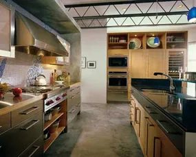
The Modern Kitchen Makeover
You want that sleek, urban aesthetic? It starts with the details. The big appliances get the glory, but the hardware and finishes do the heavy lifting in setting the mood. This isn’t just about buying new knobs. It’s about curating a vibe where function meets high-end minimalism.
Swapping Out Hardware
First things first. Look at your cabinet pulls and handles. If they are ornate, brass, or mismatched, the modern look dies immediately. You need uniformity. Stick to clean lines. Matte black, brushed nickel, or polished chrome. These finishes resist fingerprints better than glossy surfaces and blend into the background without screaming for attention.
“Hardware is the jewelry of the kitchen, but in a modern space, you want subtle accessories, not flashy statements.”
Remove your old hardware carefully. If the screw holes are stripped or don’t align with the new design, you’ll need wood filler. Sand it smooth. Prime it. Then paint if necessary. A fresh coat of cabinet paint often pairs best with modern hardware, so this might be the right time to tackle the cabinets themselves. Measure the distance between the centers of the screw holes on your new pulls. Ensure they match your existing cabinet drill patterns. If they don’t, you’re looking at a more involved repair job before installation.
Lighting as Decor
Lighting defines the urban kitchen. Avoid the standard recessed can lights unless they are dimmable and integrated into a smart system. Instead, consider pendant lights over an island or under-cabinet LED strips. These provide task lighting for prep work while adding layers of visual interest.
Choose fixtures with geometric shapes. Spheres, cylinders, or angular metal shades. Avoid anything with frills or traditional crystals. The goal is to make the light source itself a design element. If you have dark countertops, lighter fixtures will pop. If you have light cabinets, darker metal fixtures create contrast.
The Backsplash Shift
Tile is still king, but the style has changed. Subway tiles in a classic brick pattern are everywhere, but for a truly contemporary feel, look at large format tiles or slab-style backsplashes. These minimize grout lines. Grout lines collect grease and grime. Fewer lines mean less cleaning.
If you stick with subway tiles, try a stacked bond pattern instead of the offset brick. It creates a grid-like structure that feels more organized and modern. Or go for a herringbone pattern if you want texture without clutter. Keep the color palette neutral. White, gray, or even a subtle concrete look works best. Avoid busy patterns or bright colors. Let the materials speak for themselves.
Countertop Considerations
Your countertop material dictates the rest of the kitchen’s tone. Quartz is the current favorite for urban kitchens. It’s durable, non-porous, and comes in colors that mimic stone without the maintenance of marble. If you love the look of marble, choose a quartz variant that replicates the veins. Real marble etches with lemon juice. It stains with wine. Quartz resists both.
Butcher block countertops are making a comeback, but in an urban context, they are usually used as accents rather than the main surface. A small island with a wood top adds warmth to an otherwise cold space. Just be sure to oil it regularly.
Appliance Integration
The urban look favors integrated appliances. This means
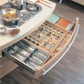

Modern Kitchens: Where Form Follows Function
Cooking isn’t a spectator sport anymore. The kitchen is the heart of the home, so your design needs to match your actual lifestyle. You don’t have to choose between looking sharp and working hard. The modernist rule is simple: form follows function. High performance and good looks can coexist.
Italian and Scandinavian designers have mastered this balance. But you don’t need to import furniture to get the look. Modern fixtures are available everywhere. Start with frameless Eurostyle cabinets. They offer clean lines and a sleek appearance that hides clutter.
Pair them with stainless steel appliances. This material is durable and timeless. If your current appliances are outdated, consider refinishing them in bold colors. It’s a cheaper alternative to replacement.
The sink matters too. Replace the old model with a stainless steel sink. It resists stains and rust. It will look just as good in twenty years as it does today.
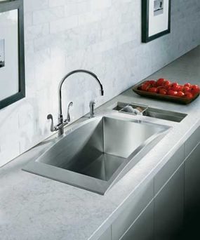

The Final Touches: Performance-Boosters for Your Modern Kitchen
You have the cabinets. You have the counters. Now you need the stuff that actually makes cooking less of a chore. This is where clever stacking storage units come into play. They are not just about aesthetics. They are about reclaiming every vertical inch of your workspace. If you are wondering how to maximize small kitchen space in a modern home, verticality is the answer.
Add a gleaming pot rack. It keeps heavy cookware off the counter and within arm’s reach. Choose a style that complements your new aesthetic. Matte black steel offers a stark contrast to white shaker cabinets. Polished brass adds warmth to a minimalist setup. The material matters less than the functionality. You want pots suspended, not buried.
Retro chrome barstools can change the entire feel of the room. They add shine without clutter. Look for models with footrests. You will be standing or sitting for long periods. Comfort is not optional when you are prepping dinner. Ensure the seat height matches your island or countertop. Measure twice. Install once.
Do not overlook drawer inserts. They are the unsung heroes of organization. Without them, utensils become a tangled mess. With them, every spatula and whisk has a designated spot. This specific type of small kitchen organization tip saves time. It prevents the frantic search for a measuring cup while your onions are burning.
These performance-boosters do more than look good. They make the kitchen work better. You are no longer fighting your environment. You are using it. Now you are cooking.
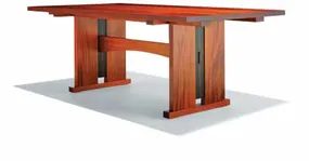

You need storage. Everyone does. But forcing bulky bins into a sleek, modern aesthetic feels like a compromise you don’t want to make. The trick isn’t hiding things away in ugly boxes. It’s integrating storage into the design so it looks intentional.
Think about where your eyes land first. If you see a messy pile of remotes, the room feels chaotic, no matter how expensive the sofa. Modern decor thrives on clean lines and open space. Clutter kills that vibe instantly. So how do you keep essentials out of sight without sacrificing accessibility? You build it into the architecture.
Built-ins That Disappear
Custom cabinetry is the gold standard for a reason. When done right, it blends into the wall. Paint the cabinets the same color as the drywall. Use handle-less fronts with push-to-open mechanisms. From across the room, you just see a smooth, unbroken surface.
This works best in living rooms and home offices. A floor-to-ceiling unit can hold books, electronics, and supplies. The key is depth. Make sure it’s not too deep. You don’t want to lose small items in the back. Keep the most-used stuff within arm’s reach. Store the rest further back.
Furniture With a Purpose
Not every home needs custom carpentry. Sometimes, the right piece of furniture does the heavy lifting. Look for ottomans with hidden compartments. A coffee table with drawers inside is a quiet miracle. You can stash blankets, magazines, or kids’ toys inside. The room stays tidy. The surface stays clear.
Consider a bench at the entryway. It should have storage underneath for shoes and coats. This keeps dirt and debris off the floor. It also reduces the pile-up of clutter right where you enter. It’s a small change. The impact is immediate.
Vertical Space Matters
Floor space is limited. Wall space is often wasted. Install floating shelves, but be selective. Don’t just pile books on them. Use them to display a few curated items. Leave gaps. Empty space is part of the design. It lets the eye rest.
If you need more storage, go higher. Install cabinets near the ceiling. These are great for seasonal items you rarely touch. Use a step stool to reach them. The daily essentials stay lower down. The seasonal junk stays out of the way.
The Hidden Nook
Every room has awkward corners or underused spaces. A narrow hallway? Add slim cabinets. A dead space under the stairs? Build drawers or shelves there. It turns wasted square footage into usable storage. You don’t need to remodel the whole house. Just look for the gaps.
“Storage shouldn’t be an afterthought. It should be part of the floor plan from the start.”
This approach requires planning. Measure twice. Buy materials that match your existing decor. Wood tones, matte finishes, or painted surfaces. The goal is cohesion. When storage disappears into the background, the home feels larger. It feels calmer.
It’s not about having less stuff. It’s about having a place for everything. That’s the real secret. The rest is just decoration.
For even more decorating ideas, see:
-
Cabin Decor
-
Country Decorating Ideas
-
Decorating Ideas
-
Window Treatment Ideas
-
Kitchen Decorating Ideas
-
Dining Room
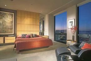

The Case for Hidden Storage in Modern Spaces
We all have too much junk for the space we have. The solution isn’t more boxes. It’s better built-in cabinetry that keeps daily clutter invisible while staying within arm’s reach. You want a modern-decor space that breathes, not one that looks like a warehouse.
Take this high-rise example. It uses handsome wood cabinetry to solve the storage crunch. The wood brings warmth. Paneling replaces sterile walls. The storage isn’t just an afterthought. It’s extensive. It handles the things you use every day.
Horizontal bars guide the eye. They are direct. Modern. They lead straight to the city view outside. This is intentional design. The storage doesn’t block the light. It frames it.
Then there’s the mix. Some shelves are open. Some cabinets are closed. This variety breaks up the visual weight. Closed boxes hide the mess. Open shelves show the good stuff. You get practicality without sacrificing style.
“A mix of open and closed storage gives the room variety.”
This approach works for any home. You don’t need a penthouse. You need to decide what stays visible and what gets tucked away. The result is a space that feels larger than it is. Because when you can’t see the clutter, the room feels lighter.
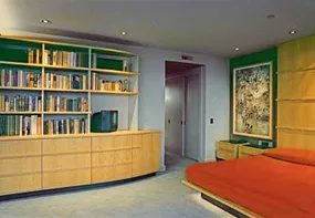

You don’t need a postcard view to stop guests in their tracks. A deep wall niche, painted in a tone that clashes just enough, turns a blank expanse into a stage. Hang a large-scale piece of art there. Make it the center of gravity for the room. The contrast does the heavy lifting. It screams for attention. Without it, you’re just looking at drywall.
Lighting changes everything. Harsh overheads kill the mood. You want drama. If recessed ceiling spots aren’t an option, look at can lights. Paint them the same color as your ceiling so they disappear. They blend in. They only reveal when you need them to. The art pops. The rest of the room fades back.
Fabric adds texture. Bright textiles thrown over a chair or draped on a shelf break up the flatness. Mix them with the colorful spines of books. It’s vibrant. It’s uncontrived. It feels lived-in, not staged.
Squares are having a moment. They’re both modern and classic. Sharp lines ground a space. They bring order to the chaos of daily life. Here is how to use them without making your home look like a gallery.
Using squares in modern decor
Start with the basics. A square rug anchors a seating area. It defines the space without walls. Pair it with square pillows. Not too many. Just enough to tie the room together.
Look at your frames. Square frames are versatile. They work with abstract art, photographs, or even mirrors. A large square mirror in a niche reflects light and makes a small room feel bigger. It’s a trick, but a good one.
Shelving units offer another opportunity. Square cubbies are functional and stylish. Fill them with books. Not just arranged by height, but by color. Let the bindings speak. The result is a library wall that looks intentional. It’s not clutter. It’s curated.
If you’re doing DIY, consider building your own square shelves. It’s straightforward. You need plywood, a saw, and some brackets. Measure twice. Cut once. Sand the edges. Paint or stain to match your niche. It’s cheaper than buying designer furniture. And it fits your space exactly.
Safety first. If you’re hanging heavy art or shelves, use studs. Drywall anchors fail. They pull out. You don’t want a $2,000 painting taking a dive onto your coffee table. Find the studs. Use a level. Mark your drill points. Precision matters.
What makes a square work in a room? It’s the balance. Too many squares feel rigid. Break it up with a round table or a curved sofa. Contrast is key. The square holds the eye. The curve relaxes it.
“Sharp lines ground a space. They bring order to the chaos of daily life.”
Don’t forget the floor. Square tiles are timeless. They’re easy to clean. They last forever. If you’re renovating a bathroom or kitchen, they’re a practical choice. Grout lines create a grid. It’s a pattern that never goes out of style.
For more ideas, check out these related categories:
-
Cabin Decor
-
Country Decorating Ideas
-
Decorating Ideas
-
Window Treatment Ideas
-
Kitchen Decorating Ideas
-
Dining Room Decorating Ideas
-
Bedroom Decorating Ideas
-
Bathroom Decorating Ideas
-
Home Office Decorating
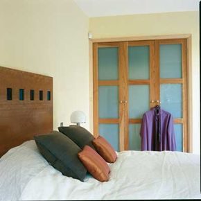
The Mackintosh Grid: Why Squares Work in Modern Interiors
Charles Rennie Mackintosh remains a defining figure in early modernist architecture. His work from the late 19th century still influences design today. The key? A strict, precise row of squares.
This geometric motif appears in many formats. It integrates easily into current decor trends. You do not need a full renovation to adopt the look.
Take the austere bedroom example. It uses the square as a repeating element. The result is a cohesive space. Modern style relies on such simple devices. They pull the look together without clutter.
Mackintosh’s grid is not just decoration. It is a structural principle that simplifies visual noise.
You can replicate this by focusing on proportion. Use square tiles. Choose square frames. Stick to clean lines. Avoid ornate details. The goal is order.
Which materials work best? Matte finishes hide imperfections. Glossy surfaces reflect light and expand small rooms. Both fit the Mackintosh aesthetic.
Safety matters when DIY-ing this style. Ensure shelves are anchored. Check electrical outlets for square-cut boxes. Precision requires care.
Why choose this look? It is timeless. It scales well. It works in rentals too. You do not need to tear down walls. Start with a square rug. Add square cushions. Layer from there.
The simplicity is deceptive. It takes discipline to keep it clean. But the payoff is a room that breathes.
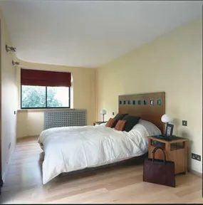

Blending Minimalism with Warmth
Sharp corners and rigid lines define the skeleton of a modern home. They look clean on paper. In reality, they can feel cold. You need something to soften that geometry. Color is the first line of defense.
Warm tones do the heavy lifting. They don’t just fill space; they invite you in. A minimalist interior doesn’t have to feel like a hospital room. It can be comfortable. It can be inviting. The trick is balancing the starkness of modern design with the emotional weight of warm hues.
You are building a space that feels like a modern fairy tale. Not the kind with castles, but the kind with light, texture, and a touch of poetry.
“A room like this is proof you can have both a minimalist design and a comfortable living space.”
This approach works because it rejects the idea that “less” means “less feeling.” You keep the lines simple. You strip away the clutter. But you add warmth through your palette. The result is a room that breathes.
Curating the Atmosphere
Modern decor offers a unique toolkit. You can layer textures. You can play with light. The goal is to create an environment that feels curated, not just decorated.
Think about how light hits the surfaces. Warm colors reflect light differently than cool grays or stark whites. They create a glow. That glow changes the mood of the room entirely. It turns a simple living area into a sanctuary.
You don’t need expensive art to achieve this. You need intention. Choose pieces that speak to you. Let the colors guide your choices. Let the warmth define the character of the space.
Where to Find More Inspiration
If you are ready to expand your design vocabulary, look into these specific areas. Each offers a different angle on home aesthetics.
- Cabin Decor : Embrace rustic materials and cozy textures.
- Country Decorating Ideas : Focus on traditional patterns and vintage charm.
- General Decorating Ideas : Broad strategies for any style.
- Window Treatment Ideas : Control light and privacy with fabric and structure.
- Kitchen Decorating Ideas : Functional spaces that still need personality.
- Dining Room Decorating Ideas : Create a focal point for gathering.
- Bedroom Decorating Ideas : Prioritize comfort and calm.
- Bathroom Decorating Ideas : Small spaces with big impact.
- Home Office Decorating Ideas : Blend productivity with personal style.
- Home Spaces : Holistic views of your entire property.
- Interior Decorating : The core principles of room design.
Modern romance isn’t about excess. It’s about the right amount of warmth in a world that can feel too cold. You set the tone. You choose the light. You define the space.
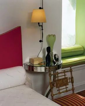

Mixing Textiles and Metallics for a Modern Fairy Tale
Most people think modern means boring. Beige walls. Sleek lines. Nothing to look at for long. This room proves that wrong. It feels like a hip fairy tale, if the fairy had a sharp sense of irony.
The bed is a study in texture. White sheeting. Satiny swirls in white. It looks effortless. Romantic without trying. The windows get the same treatment. Just swaths of white fabric hanging loose. It creates a soft backdrop for the harder elements.
Take the nightstand. It’s French Art Deco-inspired. Made of small mirrors. It reflects light. It reflects the rest of the room. It’s whimsical. Or maybe just weird. Depends on your taste. Next to it, a golden chair sits with circus-stripe fabric. Why not? It adds a kick. A bit of chaos.
Then there is the window seat. It pops. Not with noise, but with color. Shimmering green pillows. The same shade on the alcove walls. Paint matches pillows. That’s the trick. It ties the space together.
Pink. Green. White. Usually, this palette screams “child’s room.” But here, it doesn’t. Why? Because of the black touches. Sharp black lines. Dark accents. They ground the pastel whimsy. They make it serious. Adult.
You don’t need expensive furniture to pull this off. You need contrast.
Why contrast works in small spaces
The mirrors on the nightstand aren’t just decorative. They expand the space visually. Small rooms feel cramped without reflection. Add a mirrored surface and the walls push back. You get depth. You get light.
The green pillows aren’t just green. They are shimmering. Texture matters. Flat paint on walls. Shiny fabric on pillows. Matte sheets. The interplay of finishes keeps the eye moving. If everything was flat, it would feel flat.
Choosing the right accent colors
Pink and green can clash. Or they can dance. The key is the shade. Not hot pink. Not lime. Softer tones. The black handles. The black trim. It cuts through the softness. It provides structure.
Without the black, the room might feel too sweet. Too saccharine. The dark tones anchor the femininity. They make it stylish. Not childish.
Where to buy the pieces
You won’t find the mirror nightstand at the big-box store. It’s likely custom or vintage. Look for Art Deco reproductions. Or buy a plain nightstand and apply mirror tiles. It’s a DIY project if you have the patience. And the right adhesive.
The chair is easier. Look for metal frames. Spray paint them gold. Slipcover them with circus-stripe fabric. Or just buy the chair. They are common now. The trend is back.
Painting the alcove
Paint the window seat alcove the same color as the pillows. It creates a nook. A focused spot. It draws attention to the seating area. It makes the window seat feel intentional. Not just a leftover corner.
Use a semi-gloss paint. It reflects light. It cleans easier. Kids or no kids, you want easy maintenance.
The final touch
The white-on-white bedding. It’s not just white
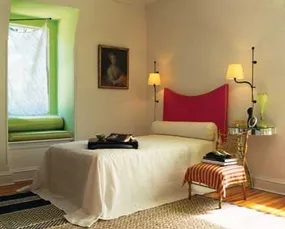
Bedroom Accessories You Can’t Do Without
You can have the perfect mattress. You can spend a weekend refinishing your headboard until it gleams. But without the right accessories, your bedroom stays just a room. It doesn’t feel like a sanctuary. It doesn’t feel like home.
The difference between a sparse bed and a dreamy one comes down to texture, weight, and layers. Think about how you want to feel when your head hits the pillow. Cool? Soft? Supported? The accessories you choose dictate that answer.
Start with the base. Sheets matter more than you think. Cotton percale gives that crisp, hotel-like snap. Linen offers that lived-in, breezy slump. If you sleep hot, stick to natural fibers. Synthetics trap heat and sweat. You’ll wake up sticky instead of rested.
Then there’s the pillow situation. Most people use two pillows. One for sleeping. One for leaning against the headboard while reading. Don’t skimp on the sleeper. If you’re a side sleeper, you need loft. Back sleepers? Medium support. Stomach sleepers? Keep it flat to save your neck. The right pillow prevents waking up with a stiff jaw.
Throw blankets are the easiest upgrade. Drape a chunky knit at the foot of the bed. Or layer a lightweight quilt over a heavier comforter. It adds depth. It makes the bed look intentionally styled rather than just made. Plus, when the thermostat fluctuates at night, you can shed layers without kicking off a heavy duvet.
Lighting sets the mood. Harsh overhead lights kill romance and relaxation. Swap those out. Try bedside lamps with warm bulbs (2700K or lower). Or install sconces to free up nightstand space. If you’re handy, you can even rewire old fixtures for a cleaner look. Just turn off the power at the breaker first. Safety first.
Don’t forget the nightstand. It’s not just for a lamp. It’s for your water glass. Your book. The medication you take before bed. Keep it clear of clutter. Visual noise keeps your brain alert. A single tray to corral small items works wonders.
And textiles? Add a runner or a small rug at the foot of the bed. It adds color. It softens the floor when you step out. Just make sure it doesn’t trip you up. Measure twice. Cut once.
“The goal isn’t to fill every inch. It’s to create a space that invites you to stay.”
Consider your storage needs. Baskets under the bed? Great for extra linens. A trunk at the foot? Double duty as seating and storage. Just ensure nothing blocks airflow around the mattress. Foam needs to breathe.
Finally, bring in something personal. A framed photo. A plant that thrives in low light (snake plant, anyone?). Art that makes you smile. These touches anchor the room to your life. They make it yours.
You don’t need to buy everything at once. Start with what you lack. Add what you love. The rest can wait.

Defining Privacy in Open Layouts
Open floor plans look great in photos. They feel expansive. But let’s be honest, they lack intimacy. You want a bedroom nook that feels separate. Isolated. Bookcases are the go-to solution here. They block sightlines while adding storage. But they aren’t the only option.
Consider folding floor screens. They’re lighter. Easier to move. And frankly, more stylish if you want a temporary wall that doesn’t scream “storage unit.” You can fold them away when guests come over. Or prop them up to create a quiet corner.
The Bed as the Anchor
No matter how you divide the space, the bed remains the focal point. It has to carry the weight of the room’s aesthetic. Don’t skimp on architectural presence. A headboard with height. Clean lines. Something that commands attention. If the bed looks like an afterthought, the whole room feels flat.
Maximizing Dual-Purpose Storage
Square footage is often at a premium in these setups. You need to make every inch work. Multi-functional furniture isn’t just a trend; it’s a necessity. Look for pieces that serve two masters.
Take a storage ottoman, for example. It’s not just a footrest. It’s a hidden closet. Stash blankets, pillows, or off-season clothes inside. Then, kick your feet up. Two functions. One footprint.
“Fit in extra storage wherever you can, especially dual-purpose pieces.”
Check for depth. Make sure the lid opens smoothly. Verify that the weight limit holds up if you’re planning to sit on it regularly. Cheap hinges fail. Sturdy wood or metal frames last.
Materials and Maintenance
If you choose bookcases as your divider, leave a gap. Air needs to circulate. Otherwise, your books will mildew. Dust accumulates faster behind them than on open shelves. Vacuum those crevices.
Floor screens are easier to clean. A quick wipe-down with a damp cloth. But watch the joints. Paper screens tear. Fabric ones stain. Leather scratches. Pick a material that matches your daily wear and tear.
Safety First
Large furniture in a bedroom needs stability. Tip-over risks are real. Anchor bookcases to the wall. Especially if kids or pets are around. Heavy items on high shelves pull centers of gravity upward. Secure them.
Check the floor level. Uneven floors cause wobbles. Use shims under folding screens if they rock. Stability isn’t just about safety. It’s about peace of mind. You shouldn’t worry about your partition tipping over while you sleep.
Final Considerations
There’s no single right answer for partitioning. Some people like the permanence of built-ins. Others prefer the flexibility of movable screens. The key is ensuring the bed stands out. And that you’re not losing all your storage space to the act of creating privacy.
Balance the visual weight. Don’t let the divider overwhelm the room. Let the bed breathe.


Start with the ground. A plush, colorful rug does more than catch stray water drops. It offers a moment of softness for bare feet waking up in the morning or winding down at night. The velvet texture absorbs the chill. It grounds the space.
Lighting matters just as much. Skip the harsh overheads. Choose a lamp that is easy on the eyes. Warm, diffused light sets a tone that feels intentional rather than clinical. It’s not just about seeing; it’s about feeling.
Then there’s the furniture. Specifically, the chaise lounge. It might seem like an indulgence for a small room. But romance isn’t always about grand gestures. Sometimes it’s about having a dedicated spot to simply exist. Who could argue with a little extra romance?
Privacy is the non-negotiable baseline for any bathroom. You need it to feel secure. But security doesn’t mean sacrificing aesthetics. Modern design proves you can have both.
Customizing Your Modern Bathroom Space
The trend isn’t about clutter. It’s about curation. When you look at how to customize a modern bathroom, think about layers. Textures. Materials that invite touch.
Consider the vanity. Is it floating? Does it have clean lines? Storage solutions that hide the daily grind—towels, toiletries, hair tools—keep the surface clear. A clear surface feels calm.
Materials play a huge role in that calm. Matte finishes hide fingerprints better than glossy ones. Natural stone adds weight and permanence. Wood introduces warmth, countering the coldness of tile and metal.
Hardware is the jewelry of the room. Swapping out standard cabinet pulls for something with character can change the entire vibe. Brass adds a vintage touch. Black matte gives an industrial edge. Choose based on the mood you want to project.
Mirrors are another key element. A large mirror can make a small space feel twice as big. Frameless mirrors look sleek and modern. Framed ones add a bit of personality. Consider placing the mirror opposite a window to bounce natural light around the room during the day.
Planning for Privacy and Style
Privacy isn’t just about curtains. It’s about how the room functions. Where does the door open? Does it swing into the room or out? If it swings in, you lose floor space. A pocket door saves that square footage. It’s a small detail that makes a big difference in tight quarters.
Window treatments need to balance light and secrecy. Frosted glass is a classic choice. It lets light in without letting the outside world look in. If you prefer openness, sheer curtains offer a layer of diffusion. They soften the harshness of direct sunlight while maintaining a view.
Shower curtains are another area for expression. A simple white curtain is functional but bland. A textured fabric curtain adds depth. A patterned one can anchor the color scheme of the room. Just ensure the liner underneath is easy to clean. Mold is the enemy of modern style.
Storage should be integrated, not an afterthought. Shelves above the toilet utilize vertical space. Niches in the shower keep bottles off the floor and out of the way. A medicine cabinet with a mirrored front doubles as storage and a visual element.
The Role of Color in Modern Design
Modern bathrooms often lean toward neutrals. Whites, grays, blacks. It’s a safe
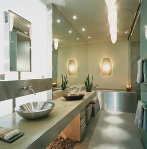

Privacy in the Open Plan
Open floor plans are all the rage, but they kill privacy. You need boundaries. If your modern bathroom lacks a conventional tub, enclose the plumbing. Use hard-wall partitions. Make them at least eight feet tall. This creates a true sanctuary within the openness.
Loft owners often have space to spare. Why not build a bath as large as a suburban master suite? You can customize the layout. A whirlpool tub fits easily. So does a steam sauna. A walk-in shower offers lifelong accessibility. Enclose the toilet in a separate compartment. These luxury options work well in loft floor plans where square footage isn’t the bottleneck.
Apartment and townhouse dwellers have less room. You can still boost comfort. If you own the place, gut the room. Borrow inches from adjacent, underused spaces. It’s a small sacrifice for a big gain.
If demolition isn’t an option, use vertical space. Install storage units from floor to ceiling. Paint the walls in cool, pale tints. This expands the visual field. Mirrors help too. They double the light and the sense of space.
Choose your hardware carefully. Black and chrome add urban punch. Brushed nickel or brass brings classic glamour. These finishes define the mood.
Hydrotherapy Comes Home
You don’t need a trip to a resort for relaxation. Hydrotherapy belongs in the home. The next steps cover how to transform your bathroom into a private spa.
Maximizing Small Bathrooms
For homeowners working with limited footprint, every inch counts.
- Borrow Space : If you own the property, consider moving walls. Even two inches from a closet or hallway can change the feel of the room.
- Vertical Storage : Don’t leave wall space empty. Cabinets that reach the ceiling eliminate dust traps and maximize storage.
- Light and Color : Pale colors reflect light. Use mirrors strategically to bounce that light around the room.
- Fixtures : Choose compact fixtures that don’t overwhelm the floor plan. A floating vanity keeps the floor visible, making the room feel larger.
Safety matters in wet spaces. Ensure non-slip flooring, especially if you add a shower. Install grab bars if accessibility is a concern. These aren’t just features; they are necessities for long-term usability.
The Spa Experience
Turning your bathroom into a spa involves more than just decor. It’s about function.
- Steam : A steam shower enclosure requires proper sealing. Consult a professional for the vapor barrier.
- Hydrotherapy Jets : Whirlpool tubs need regular cleaning to prevent mold. Check the jets monthly.
- Lighting : Dimmers are essential. Harsh overhead light kills the spa vibe. Use warm, low-level lighting.
- Ventilation : Proper ventilation prevents moisture damage. Install a high-quality exhaust fan.
The goal is comfort. Every element should serve that purpose. Whether you have a loft or a studio, the principles remain the same. Privacy, function, and relaxation.
Next Steps
Ready to start? Gather your tools. Measure your space. Decide on the layout.
For more ideas, explore these categories:
- Cabin Decor
- Country Decorating Ideas
- Decorating Ideas
- Window Treatment Ideas
- Kitchen Decorating Ideas
- Dining Room Decorating Ideas
- Bedroom Decorating Ideas
- Bathroom Decorating Ideas
- Home Office
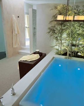

Designing a High-End Spa Atmosphere on a Budget
Modern home spas have crossed a threshold. They no longer just compete with hotel bathrooms; they rival the hydrotherapy rigs found in high-end clubs. You get the same soak, the same relaxation, the same total surrender to the water. The catch is the price tag. Commercial setups cost a fortune. But you don’t need a fortune to build a restful sanctuary. You just need to make smart choices.
Start with color. Pale neutrals are your best friend here. They do two things at once. They make the room feel bigger. That cramped bathroom suddenly breathes. They also dial down the visual noise. Less clutter in the eyes means more calm in the head. It’s basic design theory, but it works every time.
Now, look at your walls. If you have old, ugly tiles, they’re dragging the vibe down. You have two moves. You can rip them out and start fresh. Or, you can keep them and paint over them. That second option sounds risky. It isn’t, if you use the right stuff. Epoxy paint is the key. Standard latex will peel. Epoxy bonds. It sticks to the glossy, non-porous surface of existing tiles and creates a seal that lasts. It turns outdated ceramic into a seamless backdrop.
Finish the job with a quality paint on any drywall areas. Avoid flat paint. Flat paint absorbs moisture and shows every water spot. It’s a maintenance nightmare in a bathroom. Go for a low luster finish. It reflects a little light, which adds warmth. It’s easier to wipe clean. It resists the humidity that ruins cheaper coatings.
The goal is a space that feels intentional. Not a afterthought. A place where the water feels deeper, the silence feels heavier, and the stress actually leaves your body. You’re not just painting walls. You’re curating an experience.
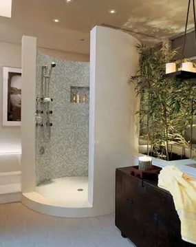

Let light in and swap the hardware
A bad shower is a drag. If yours isn’t up to par, try a quick fix: clean the stall thoroughly and hang a clear curtain. It sounds simple, but it lets more light flood the space, making it feel less like a cave.
Upgrading fixtures is another low-lift win. Replacing faucets and other fittings is fairly easy. You don’t need to be a plumber for most standard swaps. Just check your water supply valves are off before you start.
Cabinet hardware is even simpler. Swapping dated knobs and pulls is one of the fastest ways to refresh a room. You can do it in an afternoon. Grab a drill, some new hardware, and a screwdriver. Unscrew the old bits. Align the new ones. Tighten them up. Done. The room looks newer without the dust and noise of a full remodel.
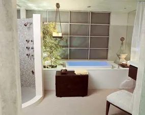
Layering is the secret. Start with a neutral throw rug. It grounds the space without shouting. Add a small chair. Or a chest. Something to break up the floor plan. Finish with candles. And a humidity-loving plant or two. The result is layered. Intentional.
Modern bathrooms often feel sterile. Cold. Like a spa waiting for customers who never show up. But they don’t have to be. You can turn a functional room into a contemporary work of art. It starts with texture. And contrast.
Think about the materials. Matte finishes against glossy tiles. Wood tones against chrome fixtures. It’s not just about what you buy. It’s about how it sits in the room. Does the light hit the mirror just right? Does the plant thrive in the steam?
A bathroom shouldn’t just be a place to get clean. It should be a place to breathe.
This isn’t about expensive renovations. It’s about curation. A few well-chosen pieces. A plant that handles the moisture. Candles that smell like earth and rain. That’s how you make it yours.
If you want to push further, look at how other rooms handle similar challenges. Cabin decor uses rough textures to soften hard surfaces. Country styling brings warmth through color and pattern. Even kitchen ideas can translate. Think about workflow. About where things live.
But for now, stick to the basics. Rug. Chair. Plant. Light. It’s a starting point. A canvas. The rest is up to you. And the next page has more.
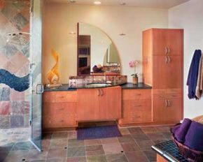
Mixing Scale for High-Impact Design
Modern interiors don’t just rely on neutral palettes to feel sophisticated. You can inject personality through fabric, sure. But in wet zones like the kitchen or bath, tiles offer a durable, waterproof alternative that’s just as expressive. The trick isn’t just picking a pattern. It’s playing with scale.
Take this bathroom. The floor and the walk-in shower are clad in large-format stone tiles. They come in a range of earthy hues. This creates a calm, expansive backdrop. The grout lines are minimal. The eye slides over the surface without getting snagged.
Then, right next to the vanity, the rules change.
A single horizontal row of nine smaller, decorative tiles breaks the monotony. These aren’t random. They’re strategically placed to add punch. The contrast between the large, subtle stone and the small, busy pattern draws attention to the sink area. It turns a functional zone into a focal point.
Why does this work?
Because the brain craves rhythm. Large tiles provide the beat. Small decorative tiles provide the syncopation. Without that break in pattern, the room might feel flat. Too much small pattern everywhere, and it feels chaotic. You need that anchor.
If you’re planning a DIY tile project, consider how you’ll transition between these scales. Large format tiles require a perfectly flat substrate. If your floor isn’t level, the tiles will look wavy. Use a laser level. Check for high spots with a straightedge.
For the decorative accent row, precision matters more. You need consistent grout lines. Use spacers. Cut the decorative tiles carefully if you need them to fit a specific width. A wet saw with a diamond blade will give you cleaner cuts than a score-and-snap tool for intricate shapes.
Safety first. Wear eye protection when cutting. The dust from stone and ceramic is fine enough to linger in the air. A respirator is better than a standard dust mask for silica.
The result?
A space that feels designed, not just decorated. The large tiles handle the heavy lifting of coverage. The small tiles provide the story. It’s a simple formula. But it requires intention. You have to choose which wall gets the attention. You have to decide where the eye should rest.
In this case, the vanity is the stage. The stone is the curtain. The small tiles are the spotlight.
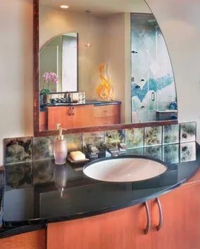
Choosing Organic Flowing Patterns Over Representational Designs
If you are leaning toward a modern aesthetic for your next renovation, skip the classic motifs. Traditional spaces often rely on tiles featuring representational images—think flowers, geometric repeats, or nature scenes rendered in a literal way. It is safe, nostalgic, and fits a specific heritage look. But if you want that sleek, contemporary vibe, the direction changes.
Modern style favors the organic.
Look for designs that flow rather than stop. The lines should mimic natural movement—water, wind, or stone erosion. You want tiles that feel alive, not static. This shift from representational to abstract organic forms is not just a trend. It is a fundamental change in how we perceive texture and space.
Why organic flows work better in modern homes
The human eye gets tired of rigid grids. Representational images create a pattern that the brain expects to repeat. When it breaks, it feels like an error. Organic flowing designs do not demand repetition. They guide the eye across the surface without forcing a stop. This creates a sense of depth and continuity that flat, pictorial tiles cannot match.
Consider the materials. You might choose large-format porcelain with a subtle, wavy texture. Or perhaps a natural stone slab with veins that drift across the floor like rivers. Both options avoid the “tile grid” look that can make a room feel small or dated. The goal is seamless integration. The tile should feel like part of the architecture, not an overlay.
How to identify the right flowing tile
When shopping, ignore the obvious patterns. Look for asymmetry. A good organic design will have irregular edges and varying thickness in its lines. It should feel hand-drawn, even if it is machine-made. Here are a few things to check:
- Line continuity: Do the lines flow from one tile to the next without obvious breaks?
- Color variation: Does the color shift subtly, mimicking natural stone or wood grain?
- Scale: Are the patterns large enough to avoid a busy, cluttered feel?
Avoid tiles with sharp, jagged edges unless you are going for an industrial look. Modern organic design prefers smooth curves. These curves soften the harsh lines of cabinetry and appliances. They bring a sense of calm to a functional space.
Installation considerations
Installing flowing tiles requires more care than standard grid layouts. You cannot simply line up the grout joints. The pattern must align across the entire surface. This means starting with a center point and working outward. You will need a laser level to keep the flow consistent. Misalignment will break the illusion of movement.
Also, consider the grout color. Dark grout can highlight the pattern, making it look intentional. Light grout can hide the seams, making the floor look like a single slab. For a truly modern look, go with a grout that matches the tile color. This minimizes the grid effect and enhances the organic flow.
Which materials best support this aesthetic?
Porcelain is a top choice. It can be engineered to mimic the subtle variations of natural materials. It is durable, water-resistant, and easy to clean. Natural stone, like marble or travertine, offers inherent organic patterns. But it requires sealing and maintenance. If you want low maintenance, porcelain is the safer bet. It gives you the look without the upkeep.
Wood-look
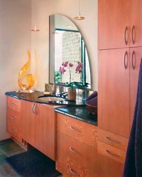
Natural stone, patterned ceramic, and glass aren’t just materials. They are tools for texture. You can layer them to create depth that mass-produced fixtures simply cannot match. This is where the Victorian style gets its soul.
But let’s be clear. Classic Victorian design often feels heavy. Dark woods. Cluttered ornamentation. Suffocating complexity.
Updating this aesthetic for modern sensibilities doesn’t mean stripping it bare. It means curating. It means taking the romance of the era and filtering it through a cleaner, lighter lens. You want the elegance, not the exhaustion.
The goal is a bathroom that feels like a refuge. Private. Serene. Distinctly yours.
Selecting the Right Tile Palette
Start with the floor and walls. These define the room’s geometry.
Natural stone tiles offer organic variation. Each piece is unique. Look for honed finishes rather than polished ones. Honed stone absorbs light softly, reducing glare while adding tactile warmth. Slate or travertine works well here.
Patterned porcelain allows for precision. You can mimic the intricate geometry of 19th-century encaustic tiles without the fragility. Look for matte glazes. They hide water spots better than high-gloss finishes in a busy bathroom.
Glass tiles serve as accents. Use them sparingly. A vertical strip behind the mirror. A horizontal band at eye level. They catch light and break up monotony. Choose frosted or textured glass to maintain privacy while adding sparkle.
Updating the Victorian Aesthetic
The key to a “modern Victorian” look is contrast. Pair ornate details with minimalist fixtures.
- Fixtures: Choose chrome or brushed nickel. These metals feel contemporary. They contrast nicely against darker tile colors.
- Mirrors: Opt for simple frames. Avoid heavy, carved wood. A thin metal frame or a frameless mirror keeps the space airy.
- Lighting: Wall sconces on either side of the mirror provide task lighting. Choose designs with clean lines. Avoid excessive crystal or prisms.
Materials and Tools for DIY Installation
Installing these tiles requires patience. It is not a weekend project if you want it to look professional.
Tools you will need:
– Rubber mallet
– Tile spacers
– Notched trowel (size depends on tile format)
– Tile cutter or wet saw
– Level
– Grout float
Safety first:
– Wear eye protection when cutting tiles.
– Use a dust mask. Silica dust from stone and porcelain is hazardous.
– Ensure your subfloor is clean and dry. Any moisture can compromise the adhesive.
Adhesive selection:
– Use a polymer-modified thin-set mortar for stone and glass. Standard mortar may not provide enough flexibility or bond strength for heavier materials.
Step-by-Step Installation Approach
- Plan the layout. Dry-fit tiles before applying adhesive. Adjust spacing to avoid narrow slivers at the edges.
- Mix the mortar. Follow manufacturer instructions. Consistency matters. Too wet, and tiles slide. Too dry, and bonds fail.
- Apply adhesive. Use the notched trowel to create uniform ridges. Comb in one direction. This ensures full coverage.
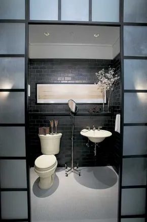

The Factory-Chic Aesthetic
You can have the drama of the Victorian era without the clutter. This approach strips away the sentimental junk and leaves the bone structure of the style intact. It is modern-decor, yes, but it wears its history openly.
The design draws directly from industrial-age factories and foundries. Think wrought iron, cast iron, and raw metal. These were the products that once trickled down to the middle class, offering them access to the elaborate furnishings previously reserved for the aristocracy. You get the ornate look, but grounded in utility.
In a bathroom, this means heavy fixtures. A clawfoot tub that looks like it came off a factory floor. Brass taps that have seen actual use. The room feels substantial. It does not float. It sits in the space like it belongs there, forged from the same logic that built the railways.
Why does this work now? Because we are tired of the sterile. The smooth, white, nothing-bout-it bathroom feels cold. This style brings back the weight. The texture. The idea that objects were made by hand, even if by machine.
You can replicate this without gutting the entire house. Start with the hardware. Swap out sleek, minimalist knobs for something with bite. Cast iron handles. Bronze finishes that patina over time. Look for sources that specialize in vintage-industrial restorations. They have the parts you need, often salvaged from actual decommissioned factories.
The key is restraint. Do not go full museum. Pick one or two statement pieces. A pedestal sink with fluted detailing. A mirror with a heavy, dark frame. Let those pieces breathe. Surround them with clean lines and neutral walls. The contrast is what makes it sing.
It is about the tension between the rough and the refined. The grit of the factory floor against the polish of the bathwater. You are not just decorating a room. You are curating a feeling. One that says you value things that last. Things that have a story. Even if you have to dig for it.
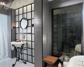

Frosted Glass for a Loft-Style Bath
You can lean into the industrial vibe with a wink rather than a straight face. Reproductions of vintage fixtures bring a romantic, slightly edgy touch to a bathroom without feeling like a museum exhibit. The trick lies in the materials. Frosted acid-wash glass panes mimic the look of old factory windows. This specific finish diffuses light while keeping things private.
The result is a distinct loft-like ambiance. It feels airy and open, yet defined. You can use these panels to partition off the commode and shower areas. It creates separate zones without closing off the room. The transparency keeps the space feeling larger. The frosting handles the modesty.
“Frosted acid-wash glass panes simulate old factory windows, giving a loftlike ambiance.”
This approach works well if you want character. It avoids the sterility of modern, sterile tile jobs. The glass is durable. It resists water spots better than clear glass. Cleaning requires a simple wipe down. You do not need harsh chemicals. A squeegee after each shower keeps the view clear.
Choose this method if you value atmosphere over strict tradition. It bridges the gap between rustic charm and contemporary living. The partitioning creates a sense of structure. Your bathroom stops feeling like a box. It becomes a space with history. Even if that history is just a reproduction.
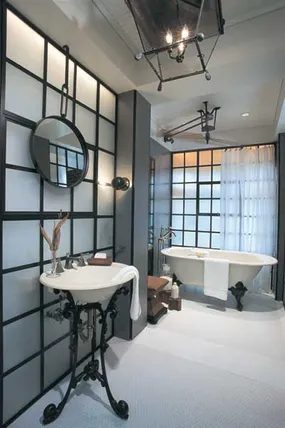

The foundation is already set. A white beadboard ceiling brings that subtle texture down from above, while classic hexagonal tiles on the floor keep the vintage urban mood grounded. It’s a specific look. One that feels historic but not dusty.
Now you add the metal.
Using metallic fixtures and accents shifts the tone. It pulls the room toward industrial and modern, but it doesn’t have to feel cold. The trick is in the selection. You want surfaces that invite touch, not just glance. Chrome offers a sharp, clean reflection. Brass adds warmth. Copper introduces an earthy depth. Each one changes how the light hits the space.
This isn’t about covering every surface in gold or silver. That’s a mistake most people make early on. Instead, treat metal as an accent layer. A matte black faucet paired with brushed nickel handles creates contrast. A copper sink under a white vanity pops without shouting. It’s about balancing the hard lines of the industrial vibe with the softness of the vintage base.
“Metallics can make a bathroom feel modern and industrial, yet still inviting if chosen carefully.”
Think about placement. Lighting fixtures are the easiest entry point. A metallic pendant above the mirror or a sconce with a brass finish frames the face and highlights the tile work. Hardware on cabinets or drawers is another low-commitment way to test the waters. Change the pulls, not the whole cabinet. It’s a small swap that signals a complete style update.
If you’re leaning into the industrial aesthetic, consider exposed pipe shelving in oil-rubbed bronze or iron. It fits the urban theme while providing practical storage. For something more subtle, a metal-framed mirror adds structure without overwhelming the small space.
The goal is cohesion. The white beadboard and hex tiles provide the history. The metals provide the edge. Together, they create a bathroom that feels curated, not accidental. It’s a balance of old and new, soft and hard, warm and cool.
Magical Metallics
For even more decorating ideas, see:
-
Cabin Decor
-
Country Decorating Ideas
-
Decorating Ideas
-
Window Treatment Ideas
-
Kitchen Decorating Ideas
-
Dining Room Decorating Ideas
-
Bedroom Decorating Ideas
-
Bathroom Decorating Ideas
-
Home Office Decorating Ideas
-
Home Spaces
-
Interior Decorating
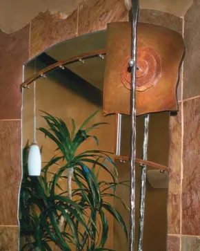

Breaking the Minimalist Mold
You probably picture modern bathrooms as sterile white boxes. Cold. Strict. Empty. That is the stereotype. But look closer at what is actually happening in high-end design right now. The line between “spare” and “spectacular” is thinner than you think.
It isn’t about stripping everything away anymore. It is about adding drama.
Consider the shift toward exuberantly shaped metallic fixtures. We are talking about faucets and handles that swirl and twist. They are not standard-issue. They are sculptural. When you mount these pieces against equally fearless backgrounds—think dark stone, bold tiles, or raw textures—the effect shifts.
It becomes otherworldly.
Some designers describe it as “romantically primitive.” It feels like you have unearthed these modern artifacts from an ancient culture. The metal looks aged, even if it is brand new. The curves mimic organic forms. This is how you avoid the showroom look. You introduce history. You introduce weight.
Modern doesn’t mean empty. It means intentional.
If you are planning a renovation, ask yourself why you are choosing chrome. Is it convenience? Or is it tradition? There is room for both. But if you want a space that feels unique, look for elements that defy the straight line. The goal is a bathroom that feels discovered, not just installed.
The trend is moving toward pieces that look like they have a story. A twisted handle tells a different story than a bar pull. It invites touch. It demands attention.
Is minimalism dead? No. But it is evolving. The new modern is less about absence and more about presence. Heavy presence. Metallic presence.
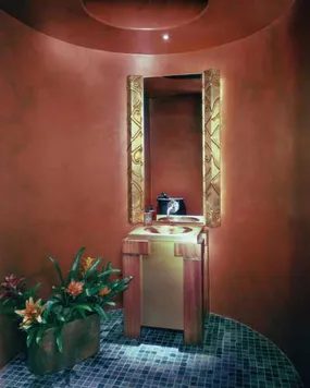
High-Impact Finishes for Small Spaces
These treatments punch way above their weight. In a powder room, they create an immediate, memorable impression. In a master bath, they cross the line from stylish to pure indulgence. But don’t let the luxury fool you.
There is something to captivate the eye at every angle. Yet, nothing is purely decorative. Every element serves a purpose. The artistry is functional. The function is artistic.
“Everywhere you look, there’s something to beguile the eye, but everything is also functional.”
This duality is what separates a trendy refresh from a timeless upgrade. You aren’t just slapping on paint. You are building a system where beauty and utility share the same space. No clutter. Just curated impact.
Why This Works for DIY
You might worry that intricate details are out of reach for a weekend warrior. They aren’t. The key is choosing materials that offer texture without requiring professional-level craftsmanship. Think peel-and-stick tiles with depth. Think hardware that adds weight and presence to a simple cabinet.
The goal is layering. One bold choice against a neutral background. It keeps the eye moving. It prevents the space from feeling static. And because every piece has a function—storage, lighting, drainage—the room never feels like a display case. It feels lived-in. Expensive, but real.
Which specific feature catches your attention first? The mirror frame? The faucet finish? The tile pattern? Whatever it is, it’s working hard. And so are you, once you start installing it.


The Cost of Uniqueness in Custom Home Design
Finding that one-of-a-kind fixture rarely happens on a standard shelf run. You are looking at a different supply chain entirely. It involves tracking down specific artisans or commissioning bespoke items for your space. The hunt can be tedious. It requires patience and a willingness to wait. But the result justifies the effort.
When you spend extra time sourcing a unique piece, you get more than just an object. You get a focal point. A custom light fixture or handmade tile backsplash changes the entire feel of a room. It adds texture and history that mass-produced items simply cannot replicate. This is where renovation stops being just construction and starts being interior design.
Why Custom Work Matters for DIYers
Some homeowners worry that custom work is out of reach. They think it is only for high-end projects with unlimited budgets. That is not entirely true. It is about value, not just price. A custom piece might cost more upfront. But it eliminates the need for future replacements. It also ensures the item fits your specific spatial constraints.
Consider a staircase. Standard railings rarely fit awkward landings. Custom fabrication solves this. It uses materials like wrought iron or solid hardwood to match the rest of your home’s character. You choose the finish. You choose the strength. This level of control is what separates a house from a home.
How to Commission Work Locally
If you want to go this route, start by looking at local makers. Artisans nearby understand regional styles and materials. They can advise on what works in your climate. For example, in humid areas, certain woods warp quickly. A local carpenter will know to suggest a more durable alternative.
You need to communicate clearly. Bring sketches. Bring photos of similar items. Define your budget early. Misunderstandings lead to costly revisions. Ask for a timeline. Custom work takes time. If you need it for a specific deadline, say so. Most artisans will try to accommodate reasonable requests.
Materials to Watch For
Not all materials are created equal. When you commission a piece, you are investing in its longevity. Here are a few options that offer high impact:
- Solid hardwoods : Oak, walnut, or cherry. They age well and can be refinished.
- Natural stone : Marble or slate. Unique veining ensures no two pieces are alike.
- Hand-blown glass : For lighting. Each bubble and color variation is distinct.
- Wrought iron : For railings and gates. Durable and timeless.
Avoid synthetic alternatives if you want that authentic feel. They may look similar at first glance. But over time, they fade or peel. Natural materials develop a patina. This is part of their charm.
Safety and Installation Considerations
Custom pieces often have specific installation needs. A heavy stone mantel requires a reinforced wall. A large glass chandelier needs a ceiling joist capable of holding the weight. Do not skip the structural assessment. Hire a professional to check load-bearing capacity if you are unsure.
Electrical work for custom lighting should always be handled by a licensed electrician. This is non-negotiable. Code violations can void insurance. They can also cause fires. Ensure the artisan provides proper wiring diagrams. Then have a pro install it.
The effort to find these special items is real. You might spend weeks searching.
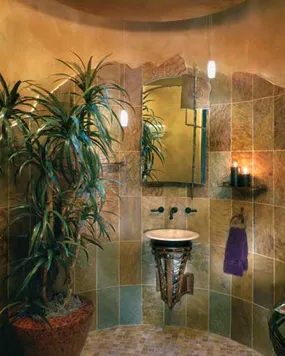
You can strip a room down to the studs and slap on the most expensive marble countertops money can buy, but if the hardware looks like it belongs in a 1970s motel, the whole aesthetic collapses. Accessories aren’t just afterthoughts. They are the punctuation marks of interior design. They define the tone.
For a modern bathroom, “modern” doesn’t just mean chrome. It means intentionality. It means choosing pieces that speak a visual language of clean lines, matte finishes, and functional minimalism. You aren’t just buying a towel holder. You are buying a statement about order and calm.
Here is how to pick the right modern pieces without turning your sanctuary into a showroom.
The Hardware Shift
The first place to look is the metalwork. Gone are the days of ornate, brass-dipped handles that scream “traditional luxury.” Modern design favors subdued tones. Think brushed nickel, matte black, or unlacquered brass that darkens over time.
Matte black fixtures are having a moment, but they require commitment. They show water spots like crazy. If you go this route, you need a daily wipe-down routine. Otherwise, your sleek showerhead will look like it has been through a sandstorm.
Brushed nickel is the safer bet. It hides fingerprints. It resists corrosion. It blends with almost any tile color. But it can feel a bit generic if you aren’t careful. To avoid the “builder-grade” look, choose fixtures with weight. A heavy, solid lever feels expensive. A hollow, plastic-feeling lever feels cheap, no matter the finish.
Towel Storage as Sculpture
Towel racks are often an afterthought. They shouldn’t be. A floating towel bar made of thick, solid steel can act as a shelf. It holds towels. It holds a small plant. It breaks up the visual noise of a large, blank wall.
Avoid the clutter of over-the-door hooks. They look temporary. They look like a dorm room. Instead, look for fixed, wall-mounted racks that protrude just enough to be useful but stay flush enough to not snag on clothes.
“The best bathroom accessories disappear until you need them, then appear exactly where they should be.”
The Mirror Frame
Your mirror is likely the largest object in the room. Does it have a frame? If so, what kind? A thick, black aluminum frame adds an industrial edge. A frameless mirror with beveled edges adds softness and makes the space feel larger.
If you have a large vanity, consider a backlit mirror. It doesn’t just provide light. It creates a halo effect that feels high-end and spa-like. Just be mindful of the electrical work. Retrofitting backlit mirrors can be tricky if you haven’t planned for the wiring behind the drywall.
Vessels and Containers
Stop using the plastic containers that came with your soap. They look cheap. They clatter. They age poorly.
Swap them for stone, ceramic, or glass. A heavy concrete soap dish feels grounded. A clear glass bottle with a pump looks clinical and clean. A ceramic vessel in a muted earth tone adds texture.
The goal is cohesion. If your tiles are white subway, keep the accessories neutral. If your tiles are bold geometric patterns,
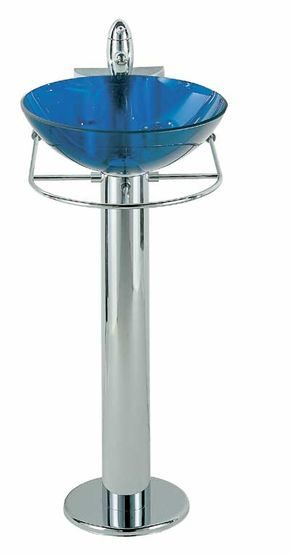

The Sink as the Star
The bathroom might be the smallest room in the house, but that doesn’t mean it has to blend into the background. In fact, modern decor allows even the tightest spaces to make a loud style statement. Every single element counts. The tub. The towel rack. The lighting. They aren’t just utilities. They are design assets that can elevate the entire scheme without stripping away practical function.
But if you’re looking for where to draw the eye, start with the vanity. The sink is usually the focal point. It sits right in the center of the action. So make it count. Don’t just settle for the standard white bowl. Look for an extraordinary design.
Choosing the Right Fixtures
When you replace fixtures, you’re changing the personality of the room. Matte black faucets contrast sharply against white quartz countertops. Brushed brass adds warmth to a cool gray tile. It’s about the interplay of texture and finish.
Consider the basin itself. A vessel sink sits on top of the counter, turning the vanity into a sculptural piece. An undermount sink keeps the surface clean and easy to wipe down. Both work, but they send different messages. Vessel sinks ask for attention. Undermounts whisper.
Materials That Last
Water is ruthless. It finds every crack. Every seam. So choose materials that can handle the humidity. Porcelain is classic. It’s durable. It’s easy to clean. But it can chip. Quartz is tougher. It resists stains better than marble. And it doesn’t require sealing like natural stone does.
If you’re doing this yourself, check the mounting hardware. Cheap faucets leak within a year. Good ones last decades. Spend the extra money on the mechanism. The chrome plating matters less than the internal valves.
Small Spaces, Big Impact
You don’t need a full remodel to make a change. Sometimes it’s just the hardware. Swap out the cabinet knobs for something with weight. A heavy pull feels substantial. A light one feels cheap.
Add a mirror that reflects light. A large framed mirror can make a tiny bathroom feel twice as big. It’s an optical trick. But it works. Pair it with good lighting above the eyes. Not just overhead. Side lighting reduces shadows. It makes shaving and applying makeup easier. And it looks better in photos.
The Towel Rack Paradox
Towel racks seem minor. Until you forget them. A rusted rack looks terrible against fresh paint. Clean lines matter. A heated towel rail adds luxury. It dries towels faster. That’s hygiene. That’s comfort. But it requires an electrical outlet or a plumbed-in hot water line. Check your wiring before you buy.
“The sink is usually the focal point, so make the most of it with an extraordinary design.”
It’s true. Everything else is supporting cast. Make the sink the lead.

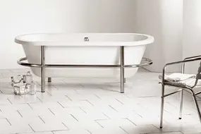

You don’t have to sacrifice personality for modernism. Your sink is a stage for your aesthetic choices. Go with a serene, Zen-inspired basin. It brings calm. Or pick something that dazzles like colorful jewelry. Bright glazes, metallic finishes, or organic shapes. Both options hold true to a clean-cut modern style. The key is intentionality. You are curating a look, not just filling a hole.
The Case for Freestanding Tubs
Built-in tubs are standard. They are practical. They fit neatly into alcoves. But they lack character. They blend in. If you want timeless appeal, look elsewhere.
Consider the freestanding tub. It has been reinterpreted for today’s bathrooms. It’s no longer just a vintage clawfoot relic. Modern versions come in sleek, minimalist forms. Soaking tubs with curved lines. Geometric shapes that anchor the room. The goal is to make the tub a focal point. A statement piece.
Why This Matters for DIY Renovations
Choosing a freestanding unit changes your floor plan. It requires space. You need room around the tub for access. You also need to think about plumbing. The drain isn’t hidden in a wall. It’s often visible. That’s part of the look. But it means your plumbing rough-in must be precise.
Freestanding tubs often sit on their own feet or a pedestal. This elevates them. It creates a sense of luxury. It separates the tub from the walls. That isolation is what makes it feel special. It feels like a spa treatment, not just a cleanup task.
Practical Considerations
Not all freestanding tubs are created equal. Some are heavy. Cast iron is durable but difficult to move. Acrylic is lighter and easier to install. It’s also warmer to the touch. Fiberglass is the most budget-friendly option. But it can feel thin.
Check the weight limit. Ensure your floor can support the tub when full. Water is heavy. A standard soaking tub holds 50 gallons or more. That’s over 400 pounds of water alone. Add the tub’s weight. Then add your weight. Your floor joists need to handle the load.
Installation Tips
If you’re doing this yourself, measure twice. The tub needs clearance on all sides. You’ll need access to the faucet. Some faucets are mounted on the wall. Others are floor-mounted. Floor-mounted faucets require a specific rough-in. Make sure your plumber knows what you’re installing.
Use a level. A wobbly tub is a safety hazard. It’s also annoying. Shims can help stabilize the tub on uneven floors. But don’t overdo it. You want a solid connection to the floor.
Mixing Styles
You can mix textures. A smooth, matte black freestanding tub contrasts well with light wood vanities. A white acrylic tub pairs nicely with concrete floors. The goal is balance. Don’t let the tub dominate the room. Let it complement the rest of the design.
Modern style isn’t about being sterile. It’s about clarity. It’s about choosing fewer things but making them count. Your sink can be loud. Your tub can be quiet. Or vice versa. The choice is yours. Just make sure it reflects who you are.
What
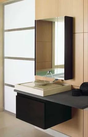

Paint is the ultimate low-lift, high-reward move. Skip the heavy demolition. Just pick a cool hue—think slate blue, icy gray, or a muted sage—and commit. It changes the entire energy of a room without requiring a contractor.
Pair that fresh coat with updated hardware. A single eye-catching faucet can shift a bathroom from dated to designer. Wall shelves do the same for cluttered surfaces, turning storage into display space. These aren’t just additions. They’re mood setters.
You don’t need a full remodel to feel the difference. A witty accent piece or a bold finish choice can make a space feel intentional. Dramatic. Cool. Colorfully alive.
How do you choose the right hue? Look at the light. North-facing rooms need warmer cool tones. South-facing ones handle crisp, clean shades better. It’s about contrast and comfort.
Tools and Safety Basics
Before you start, gather your essentials.
– High-quality brushes for edges
– Roller covers for flat walls
– Drop cloths (canvas, not plastic)
– Painter’s tape
Safety first. Ventilation is non-negotiable. Open windows. Turn on fans. Wear a mask if you’re sanding old paint. Lead paint is still a risk in homes built before 1978.
“Small changes often yield the biggest visual returns.”
Why Small Swaps Matter
Large renovations are exhausting. They cost money. They disrupt daily life. A new faucet takes an afternoon. A fresh coat of paint takes a weekend. Yet both can reset how you feel in your home.
Consider the psychological impact. Cool colors lower stress. Organized shelves reduce visual noise. It’s not just aesthetics. It’s function meeting form.
Which fixtures should you prioritize? Start with high-traffic areas. Kitchens and bathrooms see the most wear. Updating faucets and handles there gives immediate gratification. Then move to accents.
Don’t overthink it. Pick one element. Execute it well. See how it feels. Then add another.
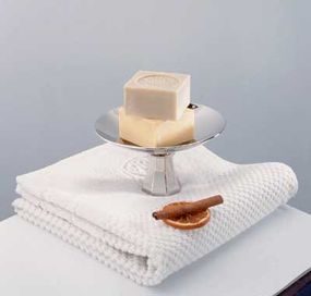

Small rooms have no place for mistakes. Every inch of wall, every surface, screams for attention. You can’t hide clutter in a tight footprint. It has to be intentional.
Designing a home office in a compact area isn’t just about fitting a desk. It’s about functionality meeting aesthetics. The goal is a space that works hard but doesn’t look like a cubicle farm. Modern style helps here. Clean lines. Minimal clutter. A focus on utility without sacrificing look.
If you are squeezing a workspace into a spare bedroom or a corner of the living room, the stakes are higher. What works in a sprawling suburban home might fail in an urban apartment. You need solutions that save space and boost productivity simultaneously.
The Modern Twist on Compact Workspaces
The key is treating the office as a design element, not an afterthought. A modern approach favors hidden storage and multifunctional furniture. Think floating shelves instead of bulky bookcases. Consider a drop-leaf table that folds away when you aren’t using it.
Lighting plays a huge role. Harsh overhead lights kill the vibe. Opt for adjustable task lighting. A sleek, minimalist lamp saves desk space while providing focused light for reading or computer work.
Color matters too. Light, neutral tones make small spaces feel larger. But don’t be afraid of a bold accent wall to define the area psychologically. It signals “work mode” without physical barriers.
Essential Elements for a Functional Home Office
- Ergonomic Chair : Your back will thank you. Don’t skimp here. A good chair supports long hours. Look for adjustable lumbar support.
- Vertical Storage : Floor space is precious. Use wall-mounted cabinets. Pegboards for tools or supplies keep things off the desk.
- Cable Management : Wires are visual noise. Use clips, sleeves, or channels to hide cords. A tangled mess is distracting and ugly.
- Technology : Ensure your Wi-Fi signal is strong. If not, consider a powerline adapter or a mesh Wi-Fi system to eliminate dead zones.
Materials and Tools
When building or assembling your office, choose durable materials. Plywood is sturdy and easy to work with for custom shelves. MDF is good for painted surfaces if you want a smooth finish. For finishing, sandpaper, wood glue, and a drill are your best friends.
Safety first. Wear goggles when cutting. Use a dust mask if sanding. Ventilate the area if you’re using strong adhesives or paints.
Why This Approach Works
A modern, space-efficient office boosts focus. Clutter distracts. A clear mind needs a clear environment. By reducing visual noise, you reduce mental load. The result is better work and a more pleasant space to spend your day.
This isn’t just about decorating. It’s about creating a functional ecosystem. One that supports your work life without consuming your entire home.
For more inspiration, explore these related topics:
– Cabin Decor
– Country Decorating Ideas
– Decorating Ideas
– Window Treatment Ideas
– Kitchen Decorating Ideas
– Dining Room Decorating Ideas
– Bedroom Decorating Ideas
– Bathroom Decorating Ideas
– Home Office Decorating Ideas
– Home Spaces
– Interior Decorating
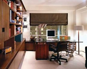

Telecommuting isn’t a side gig anymore. It’s how millions of freelancers, consultants, and small business owners live. The goal is simple. You need a workspace that feels sophisticated but stays functional. You want soothing vibes, not stress.
Think about where you work. Industrial lofts offer a unique canvas. These spaces started as workrooms before artists moved in and made them homes. Now? They are flipping back. Residents are reclaiming them as offices. The twist? You get the raw industrial aesthetic but with actual comfort and modern style.
Your furniture choice drives the room’s energy. Modern office desks can be sleek, dramatic, and performance-enhancing. They are assets, not just placeholders. But maybe you prefer tradition. Maybe your space is tight.
Computer armoires are the answer here. They hide clutter behind closed doors. They look handsome. They keep your footprint small.
Where to put your desk
Location matters more than you think.
In a loft, you have freedom. You decide where the work zone sits. Keep two things in mind though. First, find an electrical source. You need power. Second, chase the light. Natural light boosts mood and productivity.
If you are in a standard apartment, the rules change. A den or a second bedroom is ideal. It separates work from life. But what if you only have one bedroom?
Keep the bedroom for sleeping. Do not mix work with rest. Put your office in the living area instead. Use a tall screen. It creates a visual barrier. You can spread your notes out on the desk. When guests arrive, you can quickly hide the mess behind the screen. No more frantic straightening.
Embrace the square
Squares are dominating interior design right now. They fit into any scheme. They add structure. In a home office, they are perfect for storage.
Think about modular shelving. Square bins fit neatly on square shelves. It looks clean. It feels organized. Use squares to define zones in an open-plan loft. A square rug under the desk anchors the space. Square artwork on the wall breaks up the vertical lines of industrial windows.
Why squares work in small spaces
Squares are efficient. They maximize corner usage. Corners are often wasted space in lofts. A square corner shelf fills that void. It adds storage without cluttering the floor.
You can mix square shapes with the industrial elements. Metal square brackets. Glass square shelves. Wooden square frames. The contrast between hard lines and soft textures creates depth.
“Squares fill out the design scheme of any room, offering both storage and visual interest.”
Practical tips for your setup
- Measure twice. Before buying square storage units, measure your available wall space. Lofts have odd angles. Standard square units might not fit flush.
- Check weight limits. Industrial shelves are sturdy but know their limits. Don’t overload the bottom squares with heavy books.
- Use lighting. Square pendant lights over the desk provide focused illumination. They add style and function.
- Keep it decluttered. Squares create structure. Clutter destroys it. Use square bins to hide wires, notebooks, and supplies.
This approach brings order to chaos. It respects the industrial roots of the space while
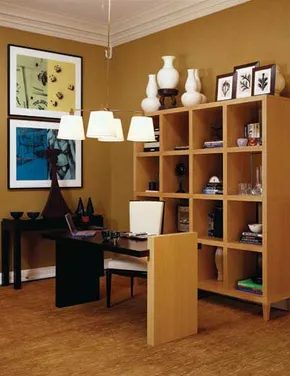

Why Open Cube Shelving Outperforms Closed Cabinets
You traded the fluorescent hum for a sunlit corner. You wanted space. But now you’re staring at a room that feels too empty or, worse, cluttered with stuff that shouldn’t be there.
Stop buying high, closed cabinets. They suck the air out of a modern home office.
Instead, look at the humble cube. Not the plastic kind from elementary school, but a sturdy, adult version. Think clean lines. Natural wood. Or matte black metal. The principle is the same: a grid of open boxes.
The Logic Behind the Open Face
Closed storage hides chaos. Open storage demands curation.
When you use cube units, you are forced to organize. You can’t just throw papers in a drawer and forget them. They sit out. That means you keep only what matters. The rest goes elsewhere.
Display storage becomes part of the decor.
* Personal treasures: A framed photo from a trip. A small plant.
* Decorative accents: A ceramic vase. A stack of coffee-table books.
* Office supplies: Pens. Scissors. Notebooks.
The airiness is the key benefit. Closed cabinets feel heavy. They block light. Cube units let light pass through. They make a small room feel bigger. They feel lighter.
Material Matters
Wood adds warmth. It softens the tech vibe. A solid oak cube feels permanent. Expensive.
Metal feels industrial. Sharp. Modern.
Plastic? Skip it unless you’re on a brutal budget. It looks cheap. It creaks.
For a home office, you want something that feels intentional. Wood is the safest bet. It blends with almost any decor style. From mid-century modern to Scandinavian minimalist.
How to Arrange the Cubes
Don’t fill every box. That’s a mistake.
Leave some empty. Negative space is part of the design. It lets the eye rest.
Put heavy items in the bottom boxes. Stability first. A filing box with paper files goes low. A lightweight decorative object goes high.
Use baskets or bins if you need hidden storage for the ugly stuff. Cables. Spare chargers. Old receipts. Put them in a cloth bin. Drop the bin into a cube. Now it’s organized but invisible.
Safety First
These units can tip.
If you have kids or pets, anchor them to the wall. Always. Use the hardware that comes with the unit. Or buy your own L-brackets. Don’t ignore this. Gravity doesn’t care about your decor.
Why This Works for DIYers
You don’t need to build this. Buy it. Or buy components.
IKEA has the Kallax. Wayfair has dozens of options. West Elm has the expensive, curated versions.
The point isn’t where you buy it. It’s that you choose open over closed.
Your home office should breathe. Closed cabinets suffocate. Cubes invite.
They invite you to look. To touch. To remember.
Is it just storage? Or is it a reflection of who you are?
Maybe both.
The boxes sit there. Waiting. For the next book you’ll read. The next photo you’ll hang. The next pen you’ll lose.
It’s simple. But simple is hard
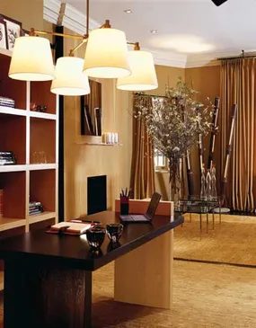

Blending Work and Leisure in a Shared Space
Painting the walls the same shade as your cube storage units is a simple trick. It makes those bulky shelves disappear into the background. Suddenly, your work area feels less cluttered. More spacious. The visual noise drops away.
But large home offices don’t have to stay just offices. Why limit one room to one function? You can merge a workspace with a media room. It’s a modern approach. It maximizes square footage. If your office is big enough, it can double as a lounge. Or a movie theater. Or both.
The key is zoning. Keep the desk area distinct from the couch or TV. Use lighting or furniture arrangement to signal the shift. One corner is for deep work. The other is for decompressing.
This multitasking layout works best when you’re disciplined. But it saves space. And it keeps your home feeling open.
Painting walls to match storage units creates a seamless backdrop, making bulky furniture feel like part of the architecture.
If you want to explore this further, check out guides on cabin decor, country styles, or general interior decorating. There are plenty of resources on window treatments, kitchen layouts, and dining room setups too. Bedroom and bathroom ideas often cross-pollinate with office design, especially when it comes to lighting and storage solutions.
Ultimately, it’s about what works for your daily rhythm. Do you need a hard reset after work? Maybe a media zone helps. Do you just want more room to breathe? Let the colors blend.
Business class doesn’t always mean mahogany desks. Sometimes it means flexibility.
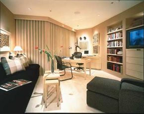
Balancing Focus and Relaxation in a Dual-Use Space
The master bedroom office isn’t just a closet with a desk. It’s a high-stakes environment where you need to switch from deep work to decompression without leaving your chair. This specific setup pulls it off by leaning heavily into a monochromatic palette of black, white, and camel. It sounds stark. It’s actually dynamic. And soothing.
The secret isn’t just the colors. It’s the intentional curation. Every item in this room serves a purpose. Nothing is decorative for the sake of decoration. That’s how you avoid the clutter that kills productivity in a home office.
Lighting and Ergonomics: The Non-Negotiables
You can’t fake good lighting. In a room that doubles as a media space, glare is your enemy. You need task lighting that hits the desk surface directly but doesn’t bounce off a screen.
“Excellent lighting is key, as is comfortable task seating.”
This isn’t optional. If your chair forces you to shift your weight every ten minutes, you aren’t working. You’re suffering. Invest in an ergonomic chair with lumbar support. Pair it with adjustable LED task lamps. You want crisp light on your documents and a softer ambient glow for when the laptop closes and the TV turns on.
The White Space Advantage
About two-thirds of this room is washed in white tones. Why? To create air.
Dark walls can feel cozy, but they can also feel heavy in a small footprint. By keeping the majority of the surface area light, you trick the eye into seeing more square footage. It reduces visual fatigue. The black and camel accents provide necessary contrast, grounding the space so it doesn’t feel sterile.
Adding Soul with Art
A room of pure white and black can feel like a showroom. That’s where the evocative African art comes in. It introduces a natural, organic note to an otherwise cool, industrial-feeling environment.
It breaks up the grid. It adds texture. It reminds the brain that this is a home, not a data center. The result is simple. It’s sophisticated. It works because it doesn’t try to do everything at once. It just does what it needs to do, perfectly.
What happens when the workday ends? The lighting shifts. The tension leaves. The room transforms. You’re still in the same spot. But the mood is entirely different. That’s the goal.
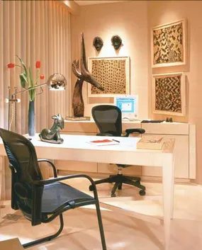

Essential Accessories for a Functional Modern Workspace
You can’t just buy a desk and call it a day. A functional workspace needs the right gear to actually work. Modern offices demand more than just aesthetics. They need utility. Here is what you should be looking at to make your setup efficient.
Start with lighting. Bad lighting kills productivity. Look for adjustable LED task lamps. They reduce eye strain. Keep them within arm’s reach of your main monitor.
Cable management is next. Nothing says “messy” like a spiderweb of wires. Use clips, sleeves, or under-desk trays. Hide the power strips. Keep your floor clear.
Storage matters too. You need spots for pens, notebooks, and chargers. Drawers are good. But floating shelves work better for vertical space. It keeps your desk surface clean. A clutter-free desk leads to a clutter-free mind.
Consider ergonomics. Your chair should support your lower back. Your monitor should be at eye level. These small tweaks prevent pain later.
If you need more inspiration, check out related decor guides. Look into cabin styles for a rustic touch. Country ideas offer warmth. General decorating tips can help with flow. Window treatments control light. Kitchen and dining ideas might inspire your break area. Bedroom decor affects rest. Bathroom updates boost morale. Home office specifics are key here. Explore home spaces for layout ideas. Interior decorating principles apply everywhere.
Design at Work
Design isn’t just decoration. It’s about how you work. Every item has a job. If it doesn’t, remove it. Keep only what serves you. This approach saves money. It saves space. It saves time.
Think about your daily routine. Where do you sit? What do you touch first? Place those items close. The rest can wait. This creates a natural workflow. It reduces friction.
Also, consider noise. If your home is loud, look for sound-absorbing panels. Or use white noise apps. Focus is fragile. Protect it.
Finally, keep it personal. Add a plant. A photo. Something that makes you smile. But don’t overdo it. One or two items. Less is often more in a modern setup.
The goal is a space that works for you. Not against you. Adjust as needed. Your needs will change. The space should adapt.
What happens when your project grows? Do you expand the desk? Or move to a new room? That’s a problem for another day. For now, focus on the basics. Get the essentials right. The rest will follow.
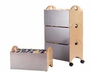
The Ergonomic Chair Imperative
You don’t need to be logging off a Zoom call to justify a dedicated workspace. Even if your “office” is just the kitchen table for paying bills and untangling a chaotic calendar, you are still sitting for hours. The physics don’t care if your work is billable or not. Your spine has the same complaints either way.
So, stop buying the first chair you see online. Blindly ordering furniture is a fast track to lower back pain and a wasted budget. You have to sit in it.
How to Test Fit an Office Chair
An ergonomically designed chair isn’t a luxury. It’s a tool. And like any tool, it needs to fit your specific mechanics. Here is how to approach the search without losing your mind or your money.
1. Check the Seat Height
Your feet must lay flat on the floor. If they dangle, your thighs compress against the edge of the seat, cutting off circulation. This is basic stuff, yet people buy chairs that are too tall all the time. Look for a chair with an easy-to-reach height adjustment lever. You should be able to change it without standing up or using a wrench.
2. The 90-Degree Rule
When you sit back, your knees should form a 90-degree angle. Your hips should be slightly higher than your knees. If the seat pan is too deep, you’ll be slouching to reach your desk. If it’s too short, your weight isn’t supported properly. Sit back. See if there’s a gap between your lower back and the chair’s lumbar support.
3. Lumbar Support Matters
Your lower back has a natural inward curve. A good chair maintains that curve. Some chairs have fixed lumbar support. Others let you adjust the height and depth. Adjustability wins. You need to be able to slide the support right into the dip of your spine. No gap. No pressure points. Just support.
4. Armrests Are Not Optional
Armrests save your shoulders. If your arms hang down, your traps do the heavy lifting. That leads to tension headaches and neck pain. Look for armrests that go up, down, forward, and back. You want them to rest comfortably under your forearms when your elbows are bent at 90 degrees. If the armrests are fixed, you’re limited.
Material and Maintenance
The fabric or mesh you choose affects more than just looks. Mesh breathes. It’s great for hot climates or if you run warm. It keeps air moving. But it doesn’t offer the same plush comfort as high-density foam. Foam holds shape better over time if it’s the right density. Cheap foam flattens. You’ll feel the hard frame underneath after six months.
Leather is easy to wipe down. It looks sleek. But it can get sticky in summer and cold in winter. Synthetic leather (bonded leather) is cheaper but peels. It doesn’t last. If you go with fabric, check if the cover is removable and washable. Spills happen. Coffee gets knocked over. Life happens.
Where to Find the Right Fit
You can’t test a chair online. Period. Go to a local furniture store. Or an office supply chain. Sit for at least ten minutes. Don’t just
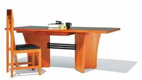

Big Surfaces for Big Ideas
If your workflow demands space to spread out blueprints, or if you regularly host clients in a dedicated home office, a large conference-style desk is often the practical answer. It provides that expansive surface area that standard tables simply lack.
For those who live inside their machines, a high-tech workstation becomes the room’s anchor. This isn’t just about having room for a keyboard. It’s about integrating power, cable management, and monitor mounts into a single, focused command center. You want the desk to handle the weight of multiple screens and the tangle of wires without looking like a disaster zone.
Choosing the Right Footprint
Size matters here. A standard 30-inch deep desk often feels cramped when you’re juggling a laptop, an external drive, and physical notebooks. Look for desks that are at least 48 to 60 inches wide. This width allows you to separate work zones—coding on one side, administrative tasks on the other—without elbow collisions.
Materials should reflect the load. Particle board might look sleek, but it sags under heavy server equipment or multiple monitors. Opt for solid wood, steel frames, or high-density laminate. Check the weight capacity ratings. A state-of-the-art setup with dual monitors, a PC tower, and peripherals can easily exceed 50 pounds of static load on the surface alone.
Wiring That Doesn’t Trip You Up
Being “seriously wired” means dealing with cables. Without a plan, it’s a mess. Look for desks with built-in grommets or under-table trays. These features route power strips and ethernet cables out of sight.
Consider a monitor arm. It frees up valuable desk real estate and allows you to adjust screen height for better ergonomics. If you’re building the setup yourself, ensure you have enough outlets. A single wall socket won’t cut it. You’ll need a quality surge protector with at least six to eight outlets, preferably with USB-C charging ports for phones and tablets.
Homework and Collaboration
This isn’t just for adults. A roomy desk serves double duty as a homework station for kids or a collaborative space for remote teams. The key is accessibility. Make sure the desk is placed where natural light helps with reading, but avoid glare on screens.
If you’re using the desk for client meetings, consider the acoustics. Hard surfaces reflect sound. Adding a rug or acoustic panels nearby can make video calls clearer. It’s a small detail that impacts professionalism.
Final Setup Tips
- Cable Management: Use velcro ties or spiral wrap to bundle cables. Label both ends of each cable before hiding them.
- Ergonomics: Ensure your chair supports your lower back. The desk height should allow your elbows to rest at a 90-degree angle.
- Future-Proofing: Leave some empty ports on your power strip. Tech evolves fast, and you’ll likely add more devices.
A big desk isn’t just furniture. It’s infrastructure. Get it right, and your work environment stops fighting against you. It starts working for you.
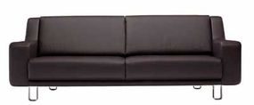

Finish Strong: The Home Office as a Sanctuary
Stop treating your home office like a punitive detention room. Instead, make it a place where you actually want to hang out. A handsome sofa does more than just provide seating; it signals a shift in mindset. You can take a proper nap on it. You can welcome guests without feeling like you’re interrupting their work. It’s about breaking the rigid rules of traditional workspaces.
Then there is the storage problem. Most people hoard paperwork because they don’t have a better system. Try a different approach to filing. Make it functional enough to work, but fun enough to not hate looking at. Put the “fun” back in “functional.” You’ll profit every day from that small design choice. It’s not just about saving space. It’s about saving your sanity.
Modern decor isn’t a one-size-fits-all template. It adapts. It fits in every room, from the smallest closet to the largest open-plan living area. It bends to your taste. It changes with your home. Don’t be afraid to tweak the ideas here. Your space should feel like you, not like a catalog spread.
About the Expert
Mary Wynn Ryan knows this stuff inside out. She’s written books on everything from kitchens to cottages. The Ultimate Kitchen. Fresh Country Style. She’s been the Midwest editor for Design Times. She even ran marketing for the Chicago Merchandise Mart’s residential design center. That’s the heavy lifting of the industry. Right now, she’s at Winning Ways Marketing, helping other people get their homes right.
Where to Go Next
If this sparked an idea, keep digging. The house is bigger than one office.
- Cabin Decor
- Country Decorating Ideas
- Decorating Ideas
- Window Treatment Ideas
- Kitchen Decorating Ideas
- Dining Room Decorating Ideas
- Bedroom Decorating Ideas
- Bathroom Decorating Ideas
- Home Office Decorating Ideas
- Home Spaces
- Interior Decorating
The work never really stops. There’s always another corner to brighten. Another shelf to paint. Another habit to change.